Cherry Hau

My most ambitious project yet; a realistic product showcase combined with stylized character animation with a unique artstyle to create a compelling advertisement targeting younger children.
The end goal for this project was to create promotional material for a mobile product concept. I created a short, stylized animation and a 3D product showcase as a video advertisement.
As a group, we had to design a product concept to fit a specific audience. We chose to design a mobile children’s toy as we found it was easier to find ideas that matched the composition of our group, with a lot of creative freedom for our two designers. As the 3D Visualizer in the group, I created the 3D product renders as well as the video advertisement.
Here is a summary of some of the goals that I completed during this project.
Our product idea was a watch with which the user would take care of a virtual pet. We started by roughly planning the product features of the device, and I quickly drew some sketches during our first group call.

My initial sketches feature a round screen 1.4.1. This was because we initially considered using a hologram prism which would sit on top of and reflect the screen - to display an illusion of a 3D projection. This would need an equal distribution of screen space in the four directions underneath each face of the pyramid, so would benefit from a round screen to minimise unused screen space.
However, this idea was quickly disposed of due to the unsuitability of the small parts required to construct the hologram prism, combined with the limited additional functionality that it gave.
We also planned to have a chunky plastic strap. This was based on a popular consumer watch that hits a very low price point which meant that we could keep costs down. The plastic construction would also mean that no metal would be in contact with the wearer which could be a concern for some. We chose to use an adjustable strap so that it would fit as many people as possible.

As we wanted to have an interchangeable strap with different options for design, I started designing methods by which the strap could be changed 1.4.2. Most of the watches I had seen used fixed pins and two-piece straps; I tried to adapt this design in a way that did not require a specialist tool to disassemble. My initial plan was to have a sliding dovetail joint which would lock in the middle, which would function similarly to an Apple watch.

I developed my sketches to better portray my design ideas 1.4.3. I also designed an external peripheral which could be used to add extra functionality to the watch without increasing the size or weight of the basic product; and could be sold separately to keep the cost down for people who did not need the additional features.

I looked up products with a similar target audience, function, and form 1.5.1, and took inspiration from them. From these, I decided to create a large, chunky design, and I also took the protective cage around the screen of other watches aimed at children and adapted it to protect the screen from being knocked easily.
I also decided to change to a square screen, both because they are more widely available and would be easier to source, and due to feedback from our group as we agreed that it would be easier to design a user-friendly user interface for the game.
I also chose to change the strap to a NATO style fabric strap, as they are very cheap and widely available in different designs and sizes. This led to switching to fixed metal pins built into the body of the watch, which would enable the user to easily switch between different strap designs without having to remove any parts or use a special tool – allowing for children to change straps without assistance and preventing a choking hazard from small loose strap pins or sharp tools. NATO watch straps are also very cheap and widely available in different designs and sizes.

I re-drew the watch design incorporating the new features from orthographic projections to visualize the final form of the product 1.5.2.
My video advertisement - and therefore the tasks relating to it – were split into two parts: the stylized cartoon animation, and the product visualization. Since I needed to create the design and photorealistic renders for other purposes, I began with the visualization segment.
As we did not have a CAD member in our group, I took on the task of creating technical drawings for our product. I looked up the documentation for the free, open-source program FreeCAD, which I used in the Sketcher and TechDraw workbench to create drawings to scale 2.1.1.

I used this to refine the exact form of the product, as well as to make sure parts were appropriately sized for their function, such as making sure the strap pins fit the strap size we wanted to use. I also designed how the screen would be inset into the body, to protect it from impact.
Using the Sketcher Workbench, I created the drawings, making sure that all the sketches were fully constrained. This made sure that I was in control of all the dimensions of the watch.
I added projections and dimensions in the TechDraw Workbench as neatly as I could and tried to make sure that every part was fully dimensioned so could potentially be manufactured from the drawings 2.1.2.

As I encountered problems and difficulties – of which there were many, due to my lack of experience with the software - I looked up forums and tutorials to try to find solutions.
One of these was trying to find a way to add a bubble note which I wanted to identify the USB-C port. Whilst I could fully dimension it - since it is a standard part, it would make more sense to specify what it is.
I found that this feature was not available in the latest stable release of the program, though was added to a development build. I downloaded the latest pre-release and finished the notation.
Once the sketches were all dimensioned and laid out in orthographic projections, I exported these as images and used them as reference images to model the device in Blender.
To make sure that I made the visualization as close to the CAD specification as possible, I imported the technical drawings as a reference image into Blender to the correct scale 2.2.1.1. I could then model over the top of these, making sure that the different elements had the correct size and location.

I initially considered using a subdivision surface modifier to create smooth curves but found that it was difficult to accurately control the radius of curves using it, and shading artifacts presented themselves around complex geometry such as the charging port cut-out.
This led to me instead using Bevel modifiers, which I could use to specify the exact radius and number of segments of the curves – the latter of which I kept low for ease of editing but would increase for the final renders.

I needed to have multiple different radii of curves around the model; using the Bevel Limit Method set to vertex groups, I could assign different radii to the different edges. I ended up with three vertex groups and three bevel modifiers of different radii 2.2.1.2.
Since the bevel modifier would make the exact curve radii around the model, I created the base mesh with perfectly square corners 2.2.1.3 and allowed the modifier stack to form the final shape 2.2.1.4.


For the strap pins, I used a Bezier curve with a Bevel Depth set under the Geometry tab 2.2.1.5, which gives thickness to the curve 2.2.1.6. This made the shape easily editable while maintaining a uniform thickness.

I used smooth shading over the whole model to smooth the transitions between faces and used an Edge Split modifier to preserve some sharp edges such as around the screen. This completed the look of the overall model – accurate to the drawings 2.2.1.7.

I also used a Boolean modifier set to difference to cut away a small gap around the buttons and where the strap pins connect to the body 2.2.1.8. This added a small amount of depth and additional realism to the model; something that most people would not notice but contributes to the overall look.

I wanted the strap to be as easily editable as possible. I considered using a curve with generated geometry, but the strap was not consistent along its length - there are too many specific details which needed to be modelled.
Instead, I used a solidify modifier combined with a bevel modifier. This meant that I could simply model the strap as a flat plane 2.2.2.1 which would be given thickness and rounded by the modifier stack 2.2.2.2.


Since the holes for the strap adjustment are evenly distributed, I used an array modifier to duplicate a single hole into a row so that I could modify them all - and the distance between them - at the same time 2.2.2.3. These also used the same combination of modifiers to give the strap thickness.

There are three main materials in use on the MiMals Watch body: chrome for the buttons and strap pins, smooth plastic for the body, and the plain material for the screen. These are very simple materials which I created using the Principled BSDF shader 2.2.3.1.

To apply the MiMals logo to the watch, I created a new material as a duplicate of the main body material. To this, I added a mix shader using a black and white version of the logo as the factor to select between the watch body material and the white for the logo.
This worked fine for a plain base material. However, this caused a problem as any texture used on the body of the watch would have different UVs beneath the logo and seams would be visible around those faces 2.2.3.2.


To solve this, I reverted the UVs to what they were before, making the main texture consistent, before adding a second UV map for the logo 2.2.3.3.
Into the image texture for the logo, I fed a UV Map node 2.2.3.4, which meant that I could use my new UV Map to specify the texture coordinates of the logo on the watch body – separate from the main watch body material below.

Having multiple UV Maps was beneficial as it meant that the main watch body UV map would be independent of the positioning of the logo, and the faces assigned to the logo material would seamlessly match with those around it as they were still connected on the main UV Map 2.2.3.5.

I created a camo pattern material for the body of the watch 2.2.4.1, which could compliment a different style of MiMal. I did this using procedural textures in Blender, meaning that it could be customized without having to make or modify a texture in an external program.

This was made by mixing multiple Noise Textures together using colour ramps with constant interpolation 2.2.4.2. These layered different colours in a random pattern to create the patchy design.

I grouped these nodes together into a node group and added additional inputs - one for each of the colours in the pattern, and the texture scale 2.2.4.3. This enabled it to be easily repurposed and customized for different uses.

As a physical NATO watch strap would be made of a woven fabric, I wanted to add a texture to mimic this. I chose to create a normal map to imitate the thread texture without adding any additional geometry; and made it tileable so that it could be repeated along the length and width of the strap.

I began by setting up a new Blender scene, with nine linked duplicates of a plane – this meant that I could make sure that the texture would tile in all directions. I cut the plane into a grid to visualize where I wanted each thread to go and to make sure that they would be aligned correctly 2.2.5.1.

Using proportional editing with a simple cylinder, I created a single piece of thread - which I then applied an array modifier to. By offsetting each row of arrays to match the grid on the plane, I created a repeating pattern that resembled the threads in the watch strap and would tile correctly. 2.2.5.2.
I did not worry about polycount as I was going to bake this into a normal map, and I also did not spend too much time making it perfectly accurate as it would be a very small detail away from the main focal point of the product. A close view of the array of threads can be seen in 2.2.5.3.

I then baked the middle square in my grid of nine into a 1k image texture. As it was such a small detail that was also tileable, I could use a smaller texture map – though it is possible to resample the texture to be smaller without having to complete the bake again.

This gave the strap the subtle woven texture that I wanted, and made it look like it was not completely flat and smooth 2.2.5.4.
Since the straps would be easily replaceable, we wanted to provide strap designs that matched or complimented the MiMal character that was included in the device.
Firstly, this would give a visual representation of the MiMal while the device was not in use, providing a potential customer with additional information about the style of the MiMal without them having to research which was included in the product.
Secondly, it also provides an aesthetically pleasing look to the device, using our designers’ considered colour-palettes to increase the visual attraction of the MiMals watch.

To achieve this, I created simple tileable textures for our three main MiMals, basing each strap design from the designs and colour palettes of each character. Starting from a 512px square in GIMP, I used the colours provided and recreated the most distinctive pattern from the MiMal to create a tileable texture which I then applied to the strap 2.2.6.1.
This really brought each design to life, adding visual interest and fun into one of the simpler components of the product. It also made the whole product more aesthetically pleasing, with the metallic colours of the main body complimenting the strap designs.
After watching advertisements for similar products from brands such as Garmin and imoo, I decided that I wanted to include a product showcase in which the product rotates in the scene showing off different features.
The animation plan for the first scene of the product showcase was to have the watch rotate, showing off the buttons then three different peripherals.
To simplify the animation, I instead had the watch stay stationary, and had the camera orbit around the watch. This meant that there was no issue trying to align the peripherals to a rotating device, or to have to set up parenting for the different parts of the watch.
I parented the camera to an empty in the centre of the watch and animated the empty rotating to orbit the camera around the watch 2.3.1.1.

All the animations on the product were very simple, with keyframed positions. There were items which required special treatment, however; the charging cable slides into the scene from the side and would be visible as the camera complete a 360° orbit around the watch.

To solve this issue, I keyframed the Display in Renders property of the charging cable. This meant that it would not be rendered until the property was enabled by a keyframe switching it on 2.3.2.1.
Another difference was the camera peripheral for the device, which I wanted to have light up the scene with the included flash. To achieve this, I animated the factor of a mix shader, switching to an emission shader shortly after the module was plugged in, and then back to glass after the module was removed 2.3.2.2.

I made it so that the light took a couple of frames to reach full brightness to make it the transition appear less sudden.
One of the main reasons we chose to use a NATO strap was due to how easy they are to change, and we wanted to showcase this. I chose to animate the strap being attached to the body of the watch in a quick and smooth motion to show off its simplicity and I took the opportunity to showcase different strap designs for our product.
I began by creating a Bezier curve which followed the path that I wanted the strap to take, then added a curve modifier onto the watch strap which would deform the strap to fit to the curve. I animated the strap moving to begin straight then deform through the curve as it passes through 2.3.3.1. This was a good start to the animation.

Whilst NATO straps are a type of single piece strap, they are formed of two pieces with the longer piece threading through the watch pins and the shorter going below. The long piece then threads through a loop at the end of the short piece, locking the watch body in place.
I separated the strap into two separate objects and created a different curve for the shorter part to follow. This allowed the short piece to take a tighter curve before where the first pin of the watch would be 2.3.3.2. The visibility of the watch body has been disabled for better visibility of the strap animation.

With both strap pieces following fixed curves and being animated together, the long piece is chasing a moving target and would not meet be able to pass through the loop of the short piece. To solve this, I needed a way to animate the shape of the curve.
Something I had used before are shape-keys, which can linearly interpolate between different vertex positions on a mesh. Similarly, these can also be used on curves and be animated through their value. Whilst this could linearly interpolate between different poses, it was difficult to use since I had to keep the long piece of the strap in the loop of the other, and this precise motion was very difficult with limited poses.
Instead, I chose to animate the points of the curves manually. This is possible in Blender using a feature called hooks, which I used to hook the control points of the curves to empty objects. Since the empties are separate to the curve and each have their own origin, I could animate the position and rotation of them in the scene like any other object 2.3.4.1.

I added hooks to all the control points of the curve that needed to be animated. Since I could animate both curves independently from object mode – and since the empties could easily be repositioned – it was a relatively straightforward, though time-consuming task to keep the two strap pieces aligned while keyframing their positions and rotations 2.3.4.2.


The completed animation can be seen in 2.3.4.3; the long strap is in the loop of the shorter segment throughout the movement. If I had longer to spend on the animation, I would have spent extra time making the movement more fluid, though I am quite happy with how it came out.
I combined this to the strap movement animation, then animated the whole watch moving onto the screen at the start of the animation, and off at the end. This made it so the animation would start and end from a blank screen which would aid later in editing when compositing different scenes together.

Duplicating the whole watch with their animations and modifying their materials allowed me to showcase different designs. I delayed the keyframes slightly on each watch to offset their animations so that the viewer could focus on one at a time 2.3.4.4.
I chose to use Cycles to render the product showcase section of the animation using physically based rendering of materials to create a more realistic looking render. To light the scene, I used a bright, neutral coloured HDRI which would provide even lighting from all directions and soft highlights on the model.
I knew that I wanted to have a background behind the watch, and text overlayed on top of it in the final video. However, I wanted to add this in editing, so that I could easily change the background without having to re-render the footage. I also wanted to be able to overlay video onto the screen of the watch.
My initial plan for this was to use a green screen style effect. 2.4.1. I set the world shader to a bright green background shader and set a green emission on the screen. I would then use a colour key in editing to set the green to transparent.

While I was doing this, I was also researching other possible methods to achieve the same effect. I found that in the Film panel of the Render Properties, I could enable transparency of the scene. This meant that if I chose an output format with an alpha channel such as PNG for images, the background would be rendered as transparent.
Since Blender could calculate the transparency as it renders, there would not be inaccurate edges around the watch or any wrong colours from green textures being partly keyed out – both of which could be problems if keyed out in editing. However, this did not solve the problem of the screen, which still rendered as the material I had assigned it.
For that, I found that I could apply a Holdout shader to parts of the mesh as a new material. When a Camera Ray hits a Holdout material, it renders the background instead of the geometry the material is applied to. Combining this with the transparent background, I could render out my animation with the background and screen completely transparent 2.4.2.

This was useful for both my animation and the designer’s posters, as we could both easily place imagery on the screen on a lower layer rather than having to cut around the screen.
While feature showcases work well to show off features of the product, it would not be attractive to our target market of children through to teenagers.

For inspiration, I watched advertisements and collected images from different products and games that were targeted at our target market 3.1.1.1. I was inspired by the mixed reality used by Moshi Monsters and Pokémon, which showed the characters interacting with people in the real world. While neither product actually included real physical interaction, it brought the characters to life and would attract members of our primary target audience.
I was also influenced by some fully animated adverts, such as one for Heinz and for Lyft. These told a short story through their stylized animation, with a fitting musical score and no speech.
From these, I chose to create a short animation which would show a character interacting with a MiMal, both physically and through the functionality of the watch.
I started with an extremely rough storyboard, its sole purpose being for me to get my thoughts down and organized 3.1.2.1.

I wanted to begin with a character travelling alone, who would then be joined by their MiMal before taking them into another world. Having the character travelling would show the portability of the device and how it can be used when on the go. The fantasy of the world changing would be interesting for the viewer and would provide a surprising and memorable moment that could not be achieved with a simple product showcase.
The user would then use the watch to get food to give to the MiMal. I was unsure as to how I would show this happening initially but settled on the MiMal - and the food later in the animation - coming out of the watch to join our character in the real world.
Since this was quite an abstract idea, I wanted to better organize my plan before beginning. This led to me using the Blender Grease Pencil to create a short animatic showing this part of my rough animation plan 3.1.2.2.

This both helped me to think about the timing of events, camera motions, and to show what my idea for the animation would be.
The hills rising in the background was my initial plan for the world transformation and can be seen in the background of the animatic. However, I still did not know how the first scene would disappear to show the background, and the speed of the hills rising was quick which distracted from the main focal point of the scene. This later changed to a simple transition instead, which I kept consistent and reused similarly throughout the video.
Before starting modelling, I decided to work on the materials and create an artistic style for the animation. As our primary audience was children, I chose to use a cartoon-like, cel-shaded art-style with bright, but low-saturation pastel colours.
Whilst my initial plan was to use simple toon-shading, I was inspired by another material I had created for a previous project 3.1.3.1.


Most of the scene uses a simple toon-shader, but the grille cloth on the amplifier cab used a normal map to calculate the colour to be shown 3.1.3.2.
This only revealed the grille cloth pattern where the light and dark were on opposite sides of the value-boundary, and this created a subtle transition between each cel-shaded colour band without introducing any additional colours 3.1.3.3.
This created a similar aesthetic to the dithered shading in the game Return of the Obra Dinn, which uses a 1-bit aesthetic, transitioning between light and dark with only two colours. I liked the look of this and chose to adapt it to shade the whole scene with a mixed-media aesthetic.
I replaced the grille cloth normal map with a bump node, feeding in a generated texture of canvas 3.1.3.4. This gave the scene a painted, mixed-media look which I was happy with. Using Window Texture Coordinates meant that the texture would fill the scene evenly without seams and would make the whole scene look like a single painting.


I created a node group from this node setup and added it to each of the materials in the scene. 3.1.3.5. This meant that I could edit the toon-shading style of all the materials at once.
To cater for each of the different materials, I set up a few additional inputs into the node group. This included the number of steps which would decide how many colours would be drawn from the lightest to darkest bands, and the minimum value that would be shown in the darkest shading band.
Variables such as the transition distance between each shading band I chose to include within the node group so that it would be consistent across all the materials.
Whilst I had added the Normal vector as an additional input, none of the materials I created ended up using a different normal map. However, this could have allowed me to change the dithering effect for certain objects.

I did many tests until I was happy with the results. Here is a simple scene showing the final material on a sphere, lit by a single point lamp 3.1.3.6.
The final exposed variables of ambient light - separated between value and colour – were used to adjust the influence of the colours of the lights themselves, and shadows in the scene. This would allow objects to be lit by different coloured lights simultaneously, and have the colours display as I chose.

I tested the extremes of the shader by creating scenes with complex lighting arrangements. Here in 3.1.3.7 can be seen the same white sphere lit by two lamps: one blue, one red. I also used a different dithering texture, and increased the ambient value input to create softer shadows within the darker bands.
The color input I used to connect image textures which I created using Krita and GIMP.
The human character was not intended to be the focus of the video. As such, I decided to design a very simple character who was bright and fun but lacking in distinct facial detail and expression. This was both so viewers could empathize with the character who was intentionally kept vague as to represent everybody, and to avoid drawing attention away from the MiMal.
Once I had an idea of what I wanted the character design to achieve, I sketched out a simple design 3.2.1.1. Keeping with minimalistic features, I went with simple round eyes as the only facial feature. Keeping a very round face from the front gives our character a young appearance, and the simple clothes and hairstyle also add to this.

I proportioned my sketches accurately and made sure that features were in alignment between views; this would later help with modelling as I could use these as background images and key features would be in the correct location.
As the character would need to interact with the watch, I chose to model all the fingers of the hands which would later be rigged.
I modelled the character in the same way as the Daisy-Mae project, adding in my sketches as background images into Blender and using them to proportion the model correctly.
I kept the base mesh relatively low-poly for editing 3.2.2.1, smoothing over the detail with smooth shading and a Subdivision Surface modifier 3.2.2.2.


The eyes are created as low-poly cube-spheres, which are inset into a depression in the face. I added a shape-key with the character’s eyes closed, the value of which would be animated to create a blink 3.2.2.3.

I formed the closed eye into a slight curve at the bottom of the eye, to mimic how a human eyelid closes from the top.
I decided to use Nurbs curves to create the hair for our character. This meant that it could be more easily created and edited than using standard geometry. I started by creating the cross-section shape for each hair clump, detailed only on one half as the other would be in contact with the head so would not be seen - which I then assigned to the geometry shape of a Nurbs curve 3.2.3.1.

The pigtails are also constructed using curves; I created a full cross section for this part 3.2.3.2 as it would be visible from all angles.

I used the shrink/fatten and tilt commands on the curve to shape each clump of hair. Duplicating the clump, I moved the nodes around the head in the direction that the hair would normally flow in: from front to back with some shorter pieces for the fringe, and the pieces at the back pointing outward towards the base of each pigtail.

I repeated this process to cover the whole head 3.2.3.3. I hid the ends of each curve by tucking them into the head or tapering them off to the ends for the fringe and shorter pieces.

For the material of the hair, I wanted to take advantage of the generated UV direction which point along the curve by default. I created a procedural material 3.2.3.4 using a Musgrave Texture which I stretched along the direction of the hair with a mapping node to create highlights, inputting the generated texture coordinates. This created a nice looking, stylized hair material 3.2.3.5.

I marked seams around the model and UV unwrapped the mesh. Since the topology is very simple – as is the texture – this was very straightforward. I aligned the UV island for the shirt upright for ease of texturing.
For the texture, I used bright block colours for most of the mesh, with a simple, two-colour check pattern for the shirt 3.2.4.1.

With the shirt UVs correctly aligned, I could add a simple pattern behind the UV-island, and have it show in the correct orientation - which I created in Krita.

That completed the modelling process 3.2.4.2.
My initial plan was to use Blender’s Freestyle to create outlines around the meshes, emphasizing the cartoon aesthetic.
It was a little inconsistent at first, and I had to change the settings to get the contours around the nose outlined correctly, eventually adding some extra geometry floating slightly in front of the face. I did get a result I was happy with in the end, with the outline colours matching the materials that they were outlining 3.2.5.1.

However, once in the scene, I found the outlines of all the objects together made the overall scene look too cluttered and messy, and the overall composition did not read as well.
In the end, I chose not to use freestyle and let the materials show the contours of the shape without the outlines. This made the overall shape read a lot more easily, and the merging of similar shapes did not create confusion - instead reducing unnecessary information in places that they were not needed which helped to keep the viewers’ focus from being distracted.
Rigging the mesh seemed simple at first, and I set up the rig with IKs in the same way as in the Daisy-Mae project 3.2.6.1.

The most difficult part was the fingers, which would each need to be able to move independently for our character to grab the watch and press buttons on it. The thumb took a few attempts to get right, and I had to change the topology of the mesh so that it would not stretch unnaturally. Tweaking the final bone weights using weight painting gave me a result that worked well.
Something that I had to do differently was add a rig to twist the arm. While the forearm is a single bone both in the rig and in real life, it is possible to twist the wrist and have the forearm flesh smoothly twist from the elbow down to the wrist in smooth transition. With the rig however, twisting the wrist caused a sudden twist at the end of the forearm, looking distractingly unnatural 3.2.6.2.


To solve this problem, I initially tried using bendy bones, but this caused the mesh to become misaligned with the rig and allowed bending along the forearm. Instead, I created multiple additional bones following the position of the forearm 3.2.6.3. I added an IK modifier to the last bone in the forearm with a chain length of three and influence over rotation; this would rotate each bone in the chain by a lesser amount creating a smoother twist.


Using bone constraints, these would follow the position of the forearm controlled by the IK but would allow the flesh of the arm to twist more smoothly down the length of the forearm.

By keeping the initial forearm bone to control the movement independent of twist 3.2.6.4, it meant that while the forearm could twist in segments, it would still not be able to bend – which is what I wanted.
As a group, we chose the cyclops-cat to be the MiMal shown in the advertisement.

I was sent this drawing of the character 3.3.1.1, designed by Abi Kusneraitis, digitized and colour palette by Josie Hitchcock; I created drawings from this in orthographic projections which I would use as reference images in Blender 3.3.1.2.

These helped to keep the proportions accurate, and to make sure the shape fitted the original character design.
I modelled the cat in the same way as I did with the human, with a low-poly base mesh 3.3.2.1 that I later detailed after applying a Subdivision Surface modifier 3.3.2.2.


The head and the tail were added as non-manifold objects to enable them to move without influencing the rest of the body. The points where the separate parts connect would be mostly hidden by the toon shading.
I UV unwrapped the model, and using a combination of GIMP and texture painting, I created the texture using the colours specified by the designers. As with the human character, I then fed the texture into the toon shader material group that I had created earlier 3.3.2.3.


With the modelling completed 3.3.2.4, it was then time to set up the armature ready for animation.
Rigging the mesh was relatively simple, as there were no complex movements required.
The forelegs were created the same way as any other humanoid character. The rear legs, however, were slightly different. These bent backwards at the knee, and the bone that joins them to the pelvis is very long and enables the thigh to fold up almost inside the body. This caused some stretching issues, which were remedied with manual weight painting. The completed rig can be seen in 3.3.3.1.

All four legs were given IK constraints to ease animation. I also added an IK constraint along the spine so that it would calculate its position based on the position of the base of the neck and the pelvis.

The tail was formed of four bones, each with a Copy Rotation constraint targeting its parent in Local Space. This meant that I could make the tail swing and curl naturally by rotating only the base of the tail, and the rest would follow along 3.3.3.2.
The eye was also given a bone, with a Track To constraint targeting an empty 3.3.3.3.

I added two additional shape-keys to the model to ease animation. The first was one with the eye closed, which would be used to animate blinking. As the cat had such a large eye, I added additional edge loops tightly around the eye to create the curved shape around the front of the head when the eye is closed 3.3.4.1.

I raised the corners of the closed eyes to form the closed eye into a curve, giving the cat a more playful look.
The second was with the mouth open, which would be used in the animation when the Cyclops-Cat was to bite some food 3.3.4.2.

I wanted to have a 3D version of the 2D fish design for the cat to interact with. However, I did not want to change the pixel-art style of the design shown on the screen. Whilst voxels were a potential option, that still would be a very different art-style with many sharp edges compared to the smooth look of the rest of the scene 3.3.5.1.

Instead, I chose to keep the pixels, and simply inflate the pixel-art into a rough shape.
With a mirror and subdivision modifier, I traced a form around the fish and gave it a slight thickness in the middle. This created a very rough looking fish shape. I then aligned the camera to the top of the fish, and used the UV Mapping, Project from View command to create a UV Map of the fish as it is seen from the camera. I aligned this to the fish texture and kept the alpha channel as transparency 3.3.5.2.

This created quite a nice-looking, simplistic 3D fish, which kept both the feel of the pixel art design and the smoothness of the rest of the scene 3.3.5.3.

I made sure to disable Merge on the mirror modifier, to preserve the normals of the intersecting faces. This was important because some thin parts of the fish - the fins and tail - needed to be drawn facing out on both sides. Also, I wanted to keep the sharp edge around the form of the fish, which would otherwise be smoothed by the subdivision.
As objects in the real world move into the distance, their colours fade towards a pale bluish grey due to particles in the air. I used this principle to mimic depth with the material for the grass and trees outside the train window.
I connected the View Distance from the Camera Data node, into a colour ramp which transitioned from a rich green into a bluish green with a much lower saturation as the distance from the camera increases.

With the bright ambient light of the outdoors, there was no shadows cast of the landscape and as such, it was rendered with a solid colour 3.4.1.1.
To match the feel of the rest of the scene and to give the terrain variety, I multiplied the colour with the canvas texture so that it would keep the canvas aesthetic and look less flat 3.4.1.2.

This shader created the illusion of a long view distance 3.4.1.3, despite the terrain only stretching the length of seven train carriages outside the window 3.4.1.4.


The design of the interior of the train carriage is based on suburban trains in the UK. 3.4.2.1

The small table is representative of this type of train and is also good for the composition as it is does not obstruct the character as a full-size table would.
I also included the commonplace fold down armrests, because similarly to the table, whilst also being common on trains, it also allowed me to have a clear path between the seats for the characters to move.
The seat cushion and headrest were curved gently using proportional editing.
For the exterior world scene, I wanted to have mountains fading into the distance to give the impression of impressive space and freedom. To create the terrain, I used the Another Noise Tool: Landscape, erosion and displace addon. Using this addon, I generated the river to use as the floor plane 3.4.3.1, angling and extending it so that the end of the river is never in the camera view.

I also added multiple mountains which I placed at different distances into the background 3.4.3.2, and applied a similar material to these as I had with the terrain outside the train window fading into bluish grey as the distance increases. For the water, I used a flat plane with a solid colour since a transparent object would break art-style.

For the character’s headphones, I chose to model them based off Audio-Technica’s ATH series of headphones. This is because they have a lot of details which would make them more interesting to look at, and a lot of hard-edged, geometric shapes which cast shadows nicely with my shader 3.4.4.1.

As the owner of a similar design of headphones, it also meant I could use a real-life reference that I can view from all angles. This is the best type of reference as I can look at any piece in detail when I need it, and from any angle.
I had originally wanted to start the animation at a railway station with the character boarding the train 3.4.5.1. However, this added too much time to the animation without adding any extra storytelling as the character can be assumed to have boarded the train by nature of her sitting in it.

This train was modelled based on the Dutch Railways DH1 unit, which I chose because the single car looked cute and matched the aesthetic of the video.
Whilst It was never used in the video, the doors were rigged with an armature 3.4.5.2 to enable them to be animated opening and closing 3.4.5.3.


Another scene that was removed was one that would show the device linking to another. I had planned to introduce a second character with a different MiMal and show the two interacting.
However, this would have required another human and MiMal character to be modelled and rigged, as it would not have been interesting if they both had the same MiMal. This would have been too much effort for such a short scene in the animation, so I did not start working on it.
In 3.4.1 Illusion of Distance, the terrain can be seen to be made from multiple planes angled slightly upwards. This enabled me to create a parallax effect with the animation - having those closer to the camera moving faster than those further away 3.5.1.1.

I added some very basic trees to move past in the background, using the same material as the landscape planes. This was to break up the monotony of the countryside fields without being overly distracting, as well as being a reference point to emphasize the parallax effect as it showed the different speeds more clearly.
This parallax effect combined with the material portrays the illusion of depth very well. 3.5.1.2

A problem I faced with the motion blur was on certain frames, the trees were drawn sharp where they alias with the sky mb1.

I found that I could reduce the motion blur's Shutter value, however, this also changed the amount of blur. Instead, I increased the Steps which would increase the accuracy of the motion blur mb2.

This slightly increased render times, though as the scene was relatively simple and rendered in EEVEE, it still took less than two seconds per frame.
I animated the camera with very few keyframes, keeping the default smooth interpolation. This created smooth camera movements between each angle which looked good, but very robotic and unnatural. 3.5.2.1

To make the camera feel less like a generated motion-tweened animation and more like somebody holding a camera on a train, I began by making sure that the camera was always slightly moving, never staying completely still.
Through looking into the documentation, I found that there were modifiers which could be applied in the Graph Editor to any animated property. I added a Noise modifier to the x and y axes, giving a slow and subtle horizontal sway and a vertical bounce to the camera 3.5.2.2.

I gave a greater strength and lower scale to the vertical motion to have more intense and faster movements up and down, which helped to give the illusion of speed - making it look like the train is moving quickly.
This is a subtle change but making sure the camera was not static contributed a lot to the feel of the video. Whilst the slight camera movements are not obvious if you are not looking for them – this is the role that the camera movements serve: avoiding the perfect movements of a motion-tween which were distractingly sterile and unnatural.
Whilst I could have had the cameras change automatically in the animation by adding a marker in the timeline, this would not have worked for my animation. This is due to my use of a transition that I wanted to add in editing which meant that there were frames in which parts of both cameras’ renders would be visible. Another reason it would not have worked is that I would have to not only change camera, but also change scene.
Instead, I chose to render each scene separately, setting the start and end frames with some overlap to account for the transition.
I also found that I could use f-curve modifiers to animate the background. With the terrain outside of the window having to move constantly, I would have to make them very long to keep them from disappearing out of frame.
However, by using the Cycles modifier on their movement property in the Graph Editor, I could loop the animation, making the terrain move back to their start position and repeat the animation once it reached the end 3.5.4.1.
An example showing a seamless loop can be seen in 3.5.4.2. Whilst the numbers can be seen jumping back, a square can be tracked moving seamlessly from one side to the other – despite moving in the same loop as the numbers.

This was also very beneficial as I could quickly change the speed of the entire animation by moving one of the keyframes, and the modifier would fill out the whole animation time automatically 3.5.4.3.

As I wanted the scenes to seamlessly transition from one to the other, I needed to make sure the camera and characters were perfectly aligned. To achieve this, I linked the assets between the scenes.

This meant that the object would have the same animations - and therefore the same global transformation - between the scenes and would be in the same place relative to the camera. 3.5.5.1 shows the same frame rendered in both scenes, and the characters can be seen to have not moved.
I needed a way to animate the cat coming out of the watch face as I had planned. This was difficult as the watch was moving with the character and the cat is a lot larger than the watch face. I decided that it would look best for the cat to taper off, getting smaller into a single point in the watch face.
I initially tried animating the bones of the cat scaling up as they moved out of the watch face but this was difficult to make look natural, and different parts would have to scale by different amounts. This was made a little easier with proportional editing, but still did not achieve a result that I was happy with.
Instead on trying to force the bones to scale how I wanted them to, I instead turned to modifiers. Being able to deform the mesh dynamically and non-destructively would be ideal, and that is what modifiers are best at doing. As with the chest from the low-poly pack I chose to use a lattice modifier.

I created a lattice cage in the shape of a pyramid with the point inside the watch which I used to deform the cat 3.6.1.1.
A stationary lattice can deform a moving mesh. In 3.6.1.2, the cat can be seen deforming whilst the armature is moving straight through the middle.

At first, I had difficulty making the cat scale to nothing below the watch face. The lattice seemed only to scale the model down by a set amount, making the cat very thin, but still obviously visible 3.6.1.3.


I found that in the lattice settings, I could change the Interpolation Type 3.6.1.4. This is set to BSpline by default, which creates a smooth deformation.
I did not want the scale to interpolate smoothly, so I set this to Linear. This allowed the mesh to collapse into a single point as I had intended 3.6.1.5 and would be completely invisible to the render when the cat is inside the watch.

For the characters, I used point-to-point animation. This allowed me to lay out the key frames first, working out timings and important poses to aim for. This was made simple with the IK Rig, only having to move the limb targets and adjust twisting with the segmented forearms.
After I had the keyframes in with approximate timings, I added in the in-betweens which smoothed the animation and gave context and feel to how the poses were arrived at. I adjusted the keyframe timings to allow for natural looking animation.
Once I reached the point in the animation where the cat had jumped out of the watch, I switched from the train to the outdoor scene. As I had linked the character assets and camera earlier, all the animation had been carried across. This meant that the characters looked the same relative to the camera and allowed for a seamless transition. I blocked in the rock that the characters are sitting on which replaced the train seat. This gave me the ground reference for where the cat would walk around the scene.
I then set about animating the cat landing from its jump, which was a particularly difficult part to animate as the cat would have to decelerate from a quick drop to almost stationary in very few frames. This looked very unnatural in my first few attempts, slowing down too quickly which made the fall and landing look like two separate animations.
To help remedy this, I watched videos of cats jumping for inspiration. Whilst our cyclops-cat’s anatomy differed from real cats - especially with the knee of the forelegs bending forwards - it was a good reference for how the energy of the landing is absorbed.
I made the front legs bend quickly, taking in the vertical momentum and converting it into forward motion with quick steps. This helped consolidate the fall as it made it look like the energy is conserved.

Furthermore, I made the spine bend as the rear legs fall, compressing into the landing with the rear legs and tail following through afterwards. This too helped to give weight to the landing and the follow through carried the momentum into the next part of the animation. 3.6.3.1
One thing that adds life to a character animation is eye movements. These can change or draw the viewer’s focus, as well as being the anticipation or follow-through for other movements. Whilst the human character’s design did not include pupils, I still animated blinking which added to the feel.
To supplement the lack of pupils, I had the character track objects with full head movements, mainly seen as the cat jumps out of the watch 3.6.4.1. This was easy to animate as I had set up the Track To bone constraint, so only had to animate the target along the cat’s path.

I did some research about when people blink and tested it myself by looking around and concentrated on working out what triggered them.
I found that there were two main things that caused blinks: after a certain amount of time, which was somewhat random, but were around three seconds apart; or when changing focus, both when just moving my eyes to look at something and when moving my whole head. Specifically, I tended to blink just as the movement started, my eyes being fully open by the time my head had settled, and occasionally blinking again afterwards to refocus.

I applied these principles to the animation of the cat and human, blinking just as an eye or head movement starts, or when there has been a significant period without a blink. Whilst a subtle detail, having the blinks manually placed rather than my initial strategy of completely randomized blinking added to the illusion of the scene, and gave the characters a more coherent feeling of life 3.6.4.2.
As part of the product showcase section of the video, I wanted to have the cat be visible on the screen. I chose to have an idle animation on the screen in the same pose as at the end of the animation segment - with the fish in its mouth. This animation would loop and be visible on the screen as the camera orbited around and showed off features of the device.
I created it as a standard animation loop, starting by duplicating the starting keyframe to the end which would make sure that the loop would be seamless. I duplicated the camera in this position and removed the noise modifiers to make sure the camera looked steady on the screen and would loop seamlessly 3.6.5.1.
I changed the resolution of the render to match the aspect ratio of the watch screen, 28x25.

Whilst I had been given designs for food items by one of our designers, there were some problems. Whilst I liked the pixel art-style which appropriately fit the game aesthetic, they were not designed strictly to a grid 3.7.1.1.

This meant that each cell of colour in the design were not all square. This is due to them having been designed on a canvas much larger than the pixel width of the food items, allowing for uneven shapes. This detracted from the overall style.
I decided to solve this by re-drawing the food assets in GIMP, using an appropriately sized canvas which would guarantee pixel accuracy. After measuring the main asset for the animation, the fish, I set up a 32x32 pixel canvas which would cover the whole design and re-drew it to the grid using the pencil tool with full opacity. This created a version of the original design with perfectly square pixels 3.7.1.2.
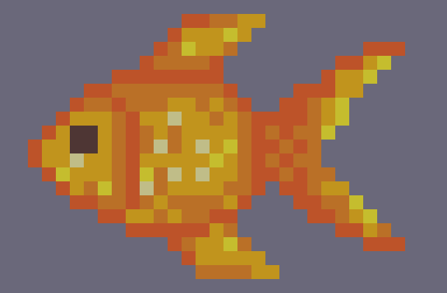
Another problem with the food assets I found when I started re-drawing the cherries. While they had appeared to be similar sizes in the initial design, their actual pixel dimensions differed greatly. This meant that if I kept the pixel scale the same, the cherries and drumstick would be a lot smaller than the more detailed fish 3.7.1.3.
Whilst I could enlarge the smaller assets, it would look uneven if the assets had different pixel scales. I solved this problem by redesigning the other assets to be the same size as the fish, making them fill the screen space whilst keeping the pixel scale consistent.
This allowed the assets to all fit the pixel grid at a similar size. The completed food texture can be seen in 3.7.1.4.
As planned in my animatic, I wanted the character to use the watch to obtain food to give to the MiMal 3.7.2.1.

While food simply came out of the watch in the animatic, I wanted to show the character interacting physically with the watch, to show how it might be used. To do this, I chose to have the character swipe through some food options, before settling on the one to give to the cat.
I also wanted a way to show a representation of the watch screen. I did not want to cut to a different camera, as I wanted to keep the animation looking as seamless as possible. It would also be impractical to move the camera into a position where it could see the watch, as it is so small and facing the other way; the camera would have to make a large movement and rotation that would either look unnaturally quick or would take up too much time.
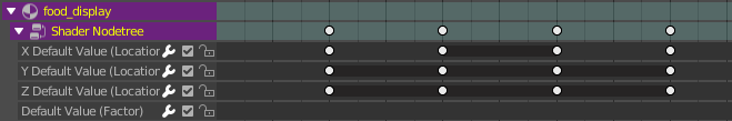
Instead, I decided to have the watch screen graphic come out of the watch as the food did in the animatic. I created the outline shape of the screen and put a curved image inside it which would display the food items. Instead of keyframing using the location and rotation keying set as usual, I added keyframes for the scale as well, having the screen representation increase in size until it reached its final position 3.7.2.2.

I added the food texture to an Image Texture in Blender and assigned the material to the watch screen. However, another problem revealed itself. As the texture was such low resolution, Blender had attempted to upscale the image to the larger texture size. This caused the sharp lines between pixels to be lost 3.7.2.3.

To solve this, I changed the interpolation of the Image Texture node from the default of Linear to Closest. This upscaled the image without attempting the interpolate, keeping the clean pixels 3.7.2.4.

I used the alpha channel in the image texture to mix in transparency behind the food items.
Now I had the different food designs in a texture on the screen, I needed to animate the movement through them. I wanted the character to use the watch, so I animated the character swiping her finger across the screen 3.7.2.5.

The expected result of this is that the food item should slide across at the same time, moving to show the next. I achieved this by animating properties in the material.
Firstly, once I had decided to have the items slide across, and the order which they would be shown, I created a new texture which had all three food items in a row with a small gap between them. This meant that I could change which item was on the screen by moving the screen’s UV Layout 3.7.2.6.


Whilst it is not possible to animate the UV Layout, the texture coordinates in the Material editor can be animated.
Using the UV Texture Coordinate input node into a Mapping node, I animated the Location property in the X-Axis to slide the texture horizontally 3.7.2.7.
I then fed this vector output into the image texture. This allowed me to animate the texture sliding across the UV space 3.7.2.8.

Now that I had a 2D and 3D version of the fish, I needed to create a way of switching from the 2D version to 3D version. Once again, I was looking for a smooth but relatively quick transition. I attempted this by mixing a transparent shader with the materials for the watch screen, and animated the factor, fading it out. I did the opposite with the 3D fish, fading it in at the same time.
There were several problems with these. With the Blend Mode set to Alpha Blend 3.7.3.1, a smooth transition is achieved, but the frame looks wrong - drawing the back faces even with full opacity. With Alpha Hashed 3.7.3.2 is better, but I did not like the look of the dithered transparency.
Both also broke art-style, as it would be the only object with transparency in the scene. Even the windows of the train and the water in the river were solid colours or fully transparent. This led me to look for an alternative solution, where I could fade the material in and out smoothly, but without using transparent objects.
While thinking about the dithered shading which smoothed the transition between shading bands on my toon shaded materials, I realized I could use a similar concept to fade the fish in and out of transparency. Instead of controlling the alpha channel of the entire object, I could use a mix of fully opaque and fully transparent sections which could be animated growing to encompass the entire mesh. This would be designed to better fit the style than the dissolving of the Alpha Hashed transparency.

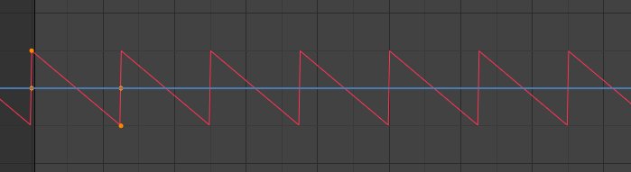
To achieve this, I used a generated Noise Texture which I fed into the factor of the mix shader 3.7.3.3. I used several math nodes to control the value from the Noise – mainly just for ease of use - finally feeding it though a colour ramp with constant interpolation before connecting it to the factor. This meant that the value could only be 0 or 1, which would therefore show as fully opaque or fully transparent.
Animating the property value into the math nodes completed the transition 3.7.3.4.
There are objects included in the animation which required connecting to armature during the animation. This happens with the fish, going from static to following the human’s hand when it is grabbed; with the fish again, going from the human’s hand to the cat’s mouth; then to the headphones, going from the human’s hands to their head. I achieved this using two different methods.
The first was by adding an Armature Modifier to the fish and assigning its bone to the hand of the human character. By animating the Render property of the modifier, I could choose to have the fish disconnected from the armature 3.7.4.1 until I enabled it on the frame where the character would grab the fish. This caused a problem however, as the global position and rotation of the fish changed as it became influenced by the armature 3.7.4.2.


In 3.7.4.2, the origin of the fish – represented by the orange circle – has not moved compared to 3.7.4.1, but the fish is now in the wrong place due to it being influenced by the armature.
I solved this by keyframing the location of the fish to the same global transformation as it was before on the frame that the armature was enabled 3.7.4.3.
This solved the problem as the fish then did not change position visually.
The second method I began by duplicating the fish and parenting it to the armature of the cat. This meant that I had a separate fish in the characters hand and the one the cat held in its mouth 3.7.4.4.

I then animated the Disable in Render property on the object. This meant that I could choose to switch on and off the rendering of either fish during the animation. Using this, I made it so that the fish in the mouth was disabled until the fish was grabbed, and only the fish in the hand would be shown. Then on the frame where the fish is grabbed, they swap, the fish in the hand being disabled while the fish in the cat’s mouth replaces it 3.7.4.5.

This method was slightly easier, as I was only working with each fish’s local transformation and did not have to worry about the armature influence changing.
For the headphones, I used shape-keys to animate the human pulling the headphones apart to lift it over her head, before allowing them to come together over her ears. As it is a simple and linear movement, it was perfect to use shape-keys for.
I added two shape-keys: one for the headphones closed together, and one slightly further apart than the basis keyframe 3.7.5.1 - both set relative to the Basis shape-key.

I animated the values of each shape key throughout the animation.
To then attach the headphones to the human’s head, I used the first method of having the armature modifier disabled until the frame where it was needed. Whilst this needed the model to be moved on the frame it was enabled, it meant that I only had one instance of the object in the scene.
However, I encountered a problem with this that I did not see with the fish. Even though it would appear to be in the same position from one frame to the next, the EEVEE motion blur – which is not enabled for the outdoor scene - registered the movement between the frames and blurred the headphones for a single frame. In this frame, the ghost of the old position of the headphones can be seen, as well as the position on the head where it was being moved to 3.7.5.2.

Whilst a potential fix would be to disable the motion blur for this single frame, it would change the look of the frame and the flicker - while subtle - would be distracting, albeit less so than the ghosting.
Instead, to solve this properly, I changed the interpolation of the transformation animation to Constant. This meant that instead of moving quickly, they would instantly teleport to the correct location.

This solved the problem of the ghost frame 3.7.5.3.
In the EEVEE render settings, I kept the default number of samples of 64 which kept the render time of each frame under two seconds. No effects other than motion blur were used as they clashed with the style of the video.
I rendered the video as an image sequence of PNGs. This is so that if I would encounter a problem during the render, I could still salvage the completed frames. I also chose this file format because it is uncompressed, and I wanted good quality images to be manipulated further in editing.
As discussed earlier, I had used a Holdout material to render the screen of the watch as transparent. This meant that I could place the animation loop on a layer below the watch in editing and have it show on the screen. It also meant that I could render the animation quickly in EEVEE whilst the watch had already been rendered in Cycles, making it a lot quicker to modify the animation on the watch.
As the watch orbited around, the screen changed angle, as well as being obscured when the watch was facing backwards. This meant that I would also have to animate the watch screen moving. Whilst this could be achieved in editing, I chose to render the movement in Blender, since I already had the camera set up and it would therefore be easier.
In the visualization scene, I disabled the watch model in the render but kept the camera rig so that the camera movements would be identical. I created a plane where the watch screen would be and assigned a material with the rendered looping animation as an image texture 3.8.2.1.

I set the frame numbers and enabled Cyclic so that it would loop, then connected this to an emission shader so that it would display the screen colours without shading. I changed the start frame of the animation so that it would line up with the end of the cartoon segment and rendered the animation.
I had received designs of MiMals characters and the logo from our designers as bitmap image files. Whilst the designs were good, they were low resolution and appeared blurry at large sizes. As the logo would be full sized on the screen at the start and end of the video, I chose to vectorize it so that it would be infinitely scalable.
I imported the logo into Illustrator and used the Image Trace function to create vector paths from the image. This produced a decent trace, which I then edited using the Direct Selection and Pen tools to match the design more accurately and to remove strange shapes where the trace had not lined up correctly.

The difference is incredible, and extremely necessary 4.1. With the resolution of the original bitmap so low, it would severely detract from the professionalism of the video as a whole - even if it would only be seen for a few seconds. The vectorized version keeps the sharp edges of the cartoon aesthetic, and the feel and most of the detail of the original design.
The MiMals characters were also a similarly low resolution. For these however, image trace did not produce an acceptable result - changing the settings solved some problems, but caused new ones. Since these were relatively detailed with consistent lines and pointed curves, any errors would appear obvious. Lines were either not kept continuous or detail was lost around the characters features, and some of the colours were not separated correctly 4.2.

For these, I chose to re-draw them manually. I created a new layer which I used for the character images as reference and locked it so that I would not accidentally select them. I also turned down the opacity of the images so that it was obvious which layer I was working on.
I traced over the image references using the Pen and Direct Selection tools. The manual control allowed me to match the original designs much more accurately, with each colour and continuous line in the correct location 4.3.

This also made sure that the geometric shapes were perfect, such as the circles for the spots and eyes of the mushroom character, and the concentric outlines on the aquatic character’s stripes were evenly distributed. This helped to keep the cartoon aesthetic, with no inaccuracies that would distract from the design.
I chose to edit the video in Adobe After Effects, to make use of the transitions, effects, and better handling of many layers and compositions. After using Premiere Pro to edit my last project, I also wanted to try something new.
My initial plan was to use a colour-key to crate the transparency in the background of animated scenes. Since the strap is green, I used a blue colour-key for this scene 5.2.1.


I used the Keylight effect in After Effects to key out the blue background 5.2.2. This allowed for quite an accurate colour-key, with the main downside being the blue coloured logos on the peripherals also being keyed out. I solved this by masking out those sections, so that they would not be affected by the colour key.
In 5.2.3 the keying can be seen, allowing me to play animated clips in the background of pre-rendered scenes.

This, however, became redundant when I discovered that I could import PNG image sequences with an alpha channel, allowing for clean edges around transparent features and preventing colour loss.
Since After Effects supports the importing of image sequences 5.3.1 as video clips, I did not have to do anything after rendering the PNGs with an alpha channel from Blender before importing them into After Effects 5.3.2.
This saved the time of converting the image sequences to video, and it also meant that I did not have to worry about maintaining the alpha channel through a video conversion.
I wanted to create a sparkle effect, which I would use multiple times throughout the animation. This would help to keep a consistent feel throughout, and make the video feel coherent.

To achieve this, I created a separate composition within the project using a lower resolution of a 512px square. In this composition, I keyframed the scale of geometric shapes with iris wipe transitions to create a sparkle particle 5.4.1.
This composition has an alpha channel so can be overlayed over footage during the animation.
Having this as a separate composition allowed me to add it into other compositions as a new layer, and I could move, rotate, and scale all the animated particles together as a single object. This meant that all I had to worry about was its position and start point, and I could duplicate it as many times throughout the video as I needed to 5.4.2.


As they were all linked from the same composition, it also meant that I could edit all the sparkle particles at the same time from the main composition, rather than having to manually update each one.

To reveal text during the video, I used a mask to create a wipe transition. To maintain the theme of the video, I used a blue line on the leading edge of the mask and added a sparkle, keeping the same combination of effects whenever text was shown in the video 5.5.1.
To transition from the stylised animation to the showcase, I had planned in the animatic to have the frame zoom out to show the watch screen 5.5.2.
I used an animated mask to cut out the background around the screen, which when placed behind the image-sequence of the watch, created the effect that I was aiming for 5.5.3.
Since the colours were slightly different from the animation to the showcase screen, instead of trying to hide the transition, I kept the same theme of outlining the wipe to change scene - but with two bands similar to the glass effect on the train windows.
To transition between scenes, I wanted to maintain the theme of geometric shapes so chose to use an iris wipe with a wide blue band to frame the transition 5.6.1. To keep a coherent feel to the video, I used the same transition multiple times.
Even though I had keyframed the emission on the camera flash to light up, it still looked relatively lifeless and unconvincing 5.7.1.

I added a Lens Flare effect, and keyframed the brightness to match the timing of the camera light. This added a lot of extra visual interest and made the light look a lot brighter and more convincing 5.7.2.

I wanted to separate the designs of the characters from the watches in the background, so I decided to create a glow effect which would provide a white halo around each character. I decided to try to do this entirely in After Effects so that I would not have to edit the images of the characters.
I began by duplicating the characters and used colour curves to push the colour values to full white. I then added a Gaussian blur effect to the stack to create a smooth transition to the background 5.8.1.

This created a nice – but subtle – separation between the characters and their background.
There needed to be sound in the video, so to fit the theme of the game, I chose to create a simple, upbeat tune using basic synthesisers. Making a pluck by having the volume decay over time, gave a bouncy, light-hearted feel to the song. I separated the bass, melody, and synth lead into separate tracks that I could bring in and out throughout the video, to increate variety.
I also created some subtle sound effects to compliment events during in the animation, such as the revealing of text or the click of buttons. The pitch slide sound effect for when the cat comes out of the watch makes it seem even more fun and less serious – perfect for our younger target audience.
I also slightly re-timed parts of the animation to fit events to beats on the song, such as the button presses sounding on the beat. Matching the visuals to the audio like this required a few iterations of tweaking but was worth it for the result of a cohesive video.