Cherry Hau

Creating a fully animated music video for a character in full anime style NPR scenes, telling the story of the lyrics through the visuals
For this project, I created an animated music video for an original song. The full video can be viewed below 0.1.
The NLT Form for this project is available here, is linked at the bottom of this article, or can be accessed direct from the footer.
Through this project I wanted to continue further into the world of NPR animation – creating full scenes and utilising some more complex compositing – by creating a video spanning multiple settings and styles. This project built on the foundation created during the Chibi Character project and the Mechanimation project.
The brief for this project was to create a music video for a YouTube channel. The aim of the video is to reinforce the story told by the music, and to provide an entertaining and inspiring piece for viewers.
The general target audience is young adults who enjoy music, animation, and the anime NPR art style, but the video was also intended to be suitable for younger viewers. This should span a reasonably large range of people, and therefore have a larger potential reach.
Whilst I have focussed on animated instruments before, it was decided that the video should have a more free flow feel to it, and therefore focus more on natural movements combined with dancing.
Whilst the character art style was already decided since the character has an established aesthetic, the plan for the music video and style for the backgrounds were free to adapt.
I watched a lot of different music videos, both animated and live-action, to see common features or ideas that may be useful.
Something that stood out is a divide between performance videos, which follow the song with singing, playing, or choreography, and story or other videos which do not follow the beat of the music at all. I chose to follow a more performance-like video, with the character at least singing along with the song.
One common feature is having the start and end of the video be in the same location, giving the sense of a circular narrative and a feeling of conclusion at the end.
A feature that I liked in the music video for Snow Man’s "W", was the use of a wider aspect ratio to add a film like cinematic feel to the video, and using the extra space created by the black bars for lyrics. This ended up being used in the final video.
Something common specifically in animated videos is the incorporation and animation of lyrics as a part of the video; I particularly like HoneyWorks’ “ヒロインは平均以下。” 1.2.1 or DECO*27 and PinocchioP’s (Not) A Devil.
However, this is commonly used when the character animation is very small, or with static images, where the focus is on the lyrics rather than the animation.
Supporting this trend are fully animated videos such as YOASOBI’s “アドベンチャー” 1.2.2 or ヨルシカ's “だから僕は音楽を辞めた”, which lack the levels of kinetic typography.
I decided that I would incorporate some of this when it felt appropriate, and did so towards the end, but did not want it to take away from the character animation.
A skill that I wish I had focussed more on is camera movements and scene changes. This proved to be more difficult than I had anticipated, but I am pleased with the result. Another skill which requires more research and practice is choreography, which I had never done before.
This project aims to fulfil the goals of the United Nations SDG 10 through being part of a YouTube campaign to spread enjoyment and knowledge to people of all demographics through inclusive content.
This is a project of entertainment and educational content that is and will be freely available, allowing everyone including people who cannot afford paid courses to learn about animation and 3D modelling.
This is also a multicultural campaign, featuring Asian and Western influence in music and other creative media.
Time planning for this project was split into two stages; creating the first and largest scene as its own mini project 1.4.1, and then producing the full video ready for release 1.4.2.
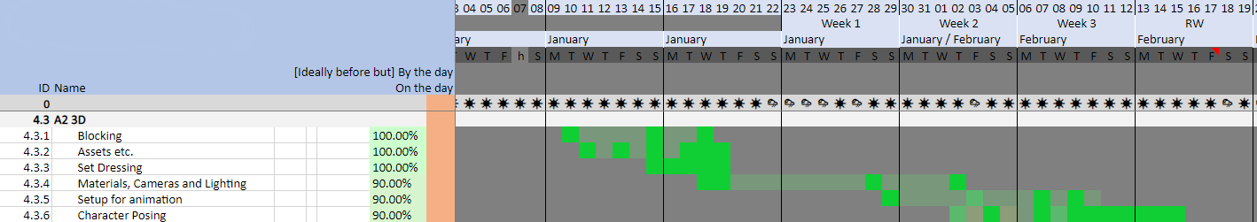

The time for these were spread out across the whole semester. Since I know that animation can take a long time to produce, and since I would be using a lot of skills for the first time, I needed to make sure that I had plenty of leeway. I chose to start the first scene production slightly before semester start to give a bit of a head start, to help make sure that everything got completed on time.
As with other projects, the most difficulty is not in managing each project but managing multiple projects around each other. This made it harder to make sure everything was running to time, especially since focussing on one project left gaps in the progression of others. Despite this, my timesheet helped to make sure everything got completed to schedule.
Before I could get to animating anything, I needed to decide what I would be animating.
For this project, I knew that I wanted to incorporate choreography in full body character animation.
I began by picking out key words from the song lyrics, which I wanted to represent in the visuals or choreography. Some key examples of this are listed below:
Certain lines I wanted to place emphasis on through having text on screen, to give more power to the words, and to represent the character emotion.
These ideas guided by the lyrics made sure that the visuals would tie in well to the song.

Originally I had been writing in a word processing program 2.1.1, but switched to a spreadsheet to better organise ideas alongside lyrics, and keep track of progress 2.1.2.

From this point, the main task became linking these different sections together.
From the plan, you can see some scenes which changed between the plan and final video; an example of this is the pre-chorus green room scene which was swapped for a dream state limbo to emphasise the disconnect between the character’s thoughts and reality, and provides a strong graphic contrast.
For file management, I followed the same methods that I have developed over previous projects. Keeping files for modelling separate from animation made it quicker and easier to edit and iterate, and kept file sizes down – most scenes being only around 10Mb, even the ones including the large exterior scene 2.2.1. The stage transition scenes are larger, since I needed to include the 3D scene to create a transition mask material for the background.

Another benefit of this is being able to jump straight into any scene to work on it, without worrying about affecting the scenes around it. This did mean that extra care was needed to make sure that continuity was managed between scenes when necessary.
This section outlines the process of creating the two main scenes featured in the music video, starting with the large exterior scene.
When I started planning the first scene, I knew that I wanted moving scenery. This meant either a road or railway line in the background, in a scene with a nice outer city suburban aesthetic.
I began watching scene building videos on YouTube of people creating scenes in game engines to try to find out how people incorporate different scenery and terrain elements together to build a coherent scene.
Something I found strange however, is that a lot of these videos feature either big cities which are often overgrown and abandoned, or are in the middle of forests and lakes. A theory for this trend is the types of asset packs available to quickly block out scenes often feature these types of assets, or that nature and greenery in game engines are quick and easy to put together to make realistic scenes.
Either way, it was not particularly helpful.
Instead, I started looking for references of 2D art featuring railways, to find a drawn aesthetic that I liked 3.1.1.1. My initial idea was to feature a railway station, with the character on one of the platforms, which explains the choice of reference images.

From this I tried to work out what type of line art, colours and textures I wanted to use. I really like the bright, saturated colours, and glare is quite prominent on bright areas.
I liked the station aesthetic, but when planning out shots I found it difficult to decide where I would place the cameras. This led me to choosing a different location.
Whilst this was happening, I was also looking for reference locations. I wanted a good place to tell the story, and was exploring photos of real locations for inspiration. With the whole world of locations to choose from, I turned to the character. With the namesake fruit of the region, I chose to focus in on the Yamagata prefecture of Japan.
To narrow the choice of locations and still wanting moving scenery, I kept looking for railway locations with interesting visual features such as background buildings or structures that would be aesthetically appealing in the video. I began following the Aterazawa line with its aptly named “Fruits Liner” trains, and settled on a location north of the city.
Exploring the area left a few areas in contention. The Mogami river bridge, whilst attractive and with an interesting history, is out in the country and surrounded by fields, which could lack points of interest. Various stations along the line were interesting, but often were cramped and lacked good camera angles, and it would be unusual for a train to run through without stopping.
Instead, I chose a spot on a short road that runs alongside the railway 3.1.1.2. This would allow shots of the trains passing, as well as longer range camera angles in most directions.
Another interesting point about this stretch of line is the two tracks being of different gauges, allowing for both rural traffic on the narrow gauge Aterazawa line and faster commuter trains and the Yamagata Shinkansen sharing the standard gauge line. This would provide even more variety where multiple different trains could make an appearance.
With the railway alongside and a level crossing in the background, there were plenty of choices for moving scenery. Combined with the variety of suburban houses on the other side of the railway line and the overhead knitting of electrical wires, this provided an attractive and interesting backdrop.
Keeping satellite and Streetview pictures up as extra reference, I also exported open source data from Open Street Map, which includes rough building locations, roads and railways, amongst other data. Using this with random building heights created a quick block out of the scene, where I started placing cameras and experimenting with angles.

A very early version of the scene can be seen in 3.1.2.1, with only a few of the close assets modelled.
I had initially planned to have the camera facing in this direction, towards the road overpass above the railway. This would have created a very built-up background with the overpass and big buildings dominating the scene. Instead, I chose to swap directions, to have more suburban houses in the background and make it look a little more rural 3.1.2.2.

Throughout this, I continued trying to work out which viewpoints I liked the look of. This would allow me to only model parts of the scene which would be in frame, saving time and effort on things that wouldn’t be seen. A benefit of the blocked out buildings is that it allowed me to quickly and easily see which houses would be in frame and would need to be modelled.
Whilst far from the rural escape of the countryside, greenery plays an important part in almost any scene. Here, I reused a particle grass system that I had been working on for the banks along the railway, and adapted my toon shader for the bushes and trees which are formed of NURBS Meatballs and spheres stuck together to form uneven blobs 3.1.3.1.

Using smoothed normals to simplify the form shadows on these plants completed the look. The simplified normals can be seen in 3.1.3.2.

Together and fully lit, they give a lot of life to the scene 3.1.3.3.

With the railway line already set up along a curve, I could simply reuse it to animate the trains passing. Adding the train into the scene as a linked asset made it simple to manipulate as a single object to which constraints can be added. Utilising a Follow Path constraint made animation easy, only requiring a slight offset to make sure the wheels aligned with the rails 3.1.4.1.
Adjusting the frame offset for the following carriages made sure that the trains stayed aligned as they pass through the scene.
A useful trick here was to add linear extrapolation to the constraint’s animation. This allowed the train to continue to move indefinitely, with the speed and offset controlled easily with only two keyframes 3.1.4.2.
Any other objects – such as the lights – that needed to follow with the train were simply parented to the train object, so that any changes to the train movement would be copied across.
The scene compositing is very simple for the backgrounds, divided into colour, line art, and sky layers. Depending on the shot, there is colour grading, blur, glare, and distance fog. More detail on compositing can be found later in the article.
An early render with the buildings modelled can be seen in 3.1.5.1.

The bumpy gravel bank under the road’s guard rail smooths the transition in materials from asphalt to grass, which makes the overall look more coherent 3.1.5.2.

Making sure the background assets are accurate to the location adds to the feel of the scene. Complex overhead wires add background interest, with the designs based on references from the area 3.1.5.3.

For my first exterior scene in NPR, I am very happy with how it came out.
With the time constraints, choosing the angles before modelling was a good choice. However, it did limit the choice of shots available, meaning a lot of angles had to be reused, and long panning shots were not possible. With longer deadlines or a less densely packed schedule, more ambitious shots would be possible.
One problem I found was that the particle grass did not correctly occlude line art. Lines that should be behind the grass was drawn in front due to how the occlusion was calculated 3.1.6.1.

It is possible to convert the particle grass into mesh which would occlude correctly and give the possibility of having its own line art, but this would make the scene a lot more complex. Additionally, the problem was so small and fairly unnoticeable, and whilst a bit strange, did not detract from the scene.
As with any other scene, I began by collecting references on stages 3.2.1.1. I knew that I wanted a look closer to a concert hall than a gig venue, for the interesting building aesthetics.

After looking at a few different layouts, whilst the big rectangular two tier venues would be easier to model, there is so much visual interest in the complex intertwined tiers of round halls that I decided that I had to pick a multi-tiered hall.
To lay out the area, I set out planes which represented each tier of seats, and would be a guide for modelling later 3.2.2.1.

When working out the angles, I spent a lot of time moving cameras around to make sure that the stage was visible from every perspective, and that none of the tiers were obstructing each other.
Once the tiers had been laid out, I modelled the seats. This was a simple unit that would be arrayed to create rows 3.2.2.2. This would make sure that every row of seats were level with the other seats along the row.

I then placed the seats correctly on the horizontal axis before making them sit correctly on each tier 3.2.2.3.

To help with vertical placement, I made use of another object constraint, the Shrinkwrap constraint. This projected down from each seat until it hit the reference planes created before 3.2.2.4.

Once the seats were in place, the gaps simply needed to be filled by walls, barriers, walkways, and doors.
The final points of detail in the stage scene are the overhead rigging, for light and sound 3.2.3.1.

Whilst the whole scene is mostly static, the spotlights were required to follow the character as she moves around the stage.
This was achieved as a simple 2 axis rotation rig, with a bone controlling yaw, and a bone controlling pitch 3.2.3.2.

These were both set up with Locked Track constraints, which would target the character. This meant that as the character moved around, all the lights would point towards her 3.2.3.3.
One of the things I wanted to include was text on screen to emphasise certain lines.
I tested placement of text in the video editor, before deciding if the text should be in the 3D scene or overlayed in post. I ended up using both of these techniques.

A test layout of the text in the viewport can be seen for the line “hear my plea” in 4.1.1. This ended up becoming part of the render, layered behind the character in compositing. Additionally, the subtitles showing the lyrics were removed whilst lyrics are on screen to remove the duplicate text.
Another example of text becoming part of the scene can be seen in the viewport render below 4.1.2.

Opposingly, the test render for “still calling out” can be seen below in 4.1.3. This is overlayed in video editing, with the reflection being a mirror image with lowered opacity.

Since nothing was occluding the text, this could be added in post without issue, allowing additional freedom in editing without having to render the scene again.
For this project, I chose to use point to point animation. This meant that I could pose the character into key positions to the beat of the music, then fill in the in-betweens afterwards. This made sure that each movement hit key poses exactly when they were supposed to 4.2.1.
As with any animation, I once again followed the animation principles outlined in Richard Williams’ The Animator's Survival Kit – specifically using a healthy dose of anticipation and overshoot. This gave extra weight to the movements whilst making them look more natural.
I rendered every scene from the viewport to quickly check the pacing and flow between different scenes 4.2.2.
This gave a low quality preview with the correct timings to the audio which I could use to make sure that continuity was kept and everything flowed together in a coherent manner.
Something I did to help with flow between scenes was anticipating actions that were going to occur in the following scenes, such as pulling back before a forward motion, which continued into the next shot. This helped to make it feel like a seamless camera change rather than a complete change of scene.
As mentioned above, one of the key visuals I wanted to include were wings which would spread across the frame.

I began this with research into how wings work, how they fold and pivot, and where the bones and feathers are 4.3.1. Following this, I built the main structure and bones of the wing. The feathers followed after, layered across each bone 4.3.2. I made sure that each clump of feathers followed the respective bones, as they did in the reference pictures and footage.

The feathers use a modified version of the hair shader, and is the same colour as the hair to keep the overall character design coherent. Initially, the wing structure was skin coloured, since that would be likely be its colour should it exist in reality. However, whilst technically an extension of the fingers, being skin coloured made it look a little eerie, so I resorted to a colour similar but separate to that of the feathers.
Rigging the wing resulted in additional bones to control the feathers, at the start and end of each clump 4.3.3. These were controlled by a combination of manual control and constraints which would spread and collect each clump.

I regularly tested the rig in folded and extended position whilst weight painting, to make sure that the transition was smooth and everything followed correctly 4.3.4.
Overall, I am very happy in how the wings turned out, and the impact they make on the scene they are in. The rig allowed for some very expressive motion, which complemented the video well.
As mentioned in the scene creation section, the scenes were split into multiple render layers in order to give more control over different parts of the image and to create the intended effect.
Most scenes had similar setups for render layers 4.4.1.1.

Some scenes include layers for overlayed lighting effects, amongst others.
Having it broken up into sections like this allows separate compositing effects for different layers, giving greater creative control over the final outcome.
One of the most important compositing tools is colour grading, which is used throughout the video to create and maintain the aesthetic throughout. This is used to emphasise the cool tones in the scene, and to make the colour contrast of the character greater against the backgrounds.
The final scene uses strong colour grading to give a night time effect; this scene is shot day for night, which is a common technique used in film. The render is a brightly lit shot, which is then colour graded to look like night time. The benefit of this is that it maintains the clarity and definition of light and shadow, whilst still having the feel of a dark night time scene.
Some effects are frame controlled, so that they can fade in and out throughout the scene time. This was achieved by running a frame counter through a Map Range node, which interpolates between target frames that can be set exactly. This is slightly easier to adjust than animated values, since animated values in the compositor can get lost in the dope sheet, and being able to see the exact frame numbers at all time is more visual.
The most obvious use of this was for the glow effect 4.4.3.1 which faded in and out throughout the scene.
Another use for this was the appearance of the stage, and the fading in of the sky towards the end.
One of the most interesting looks from compositing was the black and white scene during the pre-chorus 4.4.4.1. This is achieved with the usual set of render layers, but only using the opacity rather than the colour data.

This scene also incorporates a very interesting method of incorporated text.
Wanting emphasis on the words at the start of the line, I wanted to have the text big on screen with the character. My initial plan of having the text behind the character was not very legible however. Instead, I chose to combine them in compositing again.
Keeping with the theme of block colours, I made the text the same colour as the character. However, this had the same problem as before, since the overlapping portions were unclear.
To solve this, I created a simple “and” logic gate using math nodes to check if the text and character were overlapping, and switching colour if so. The colour choice is based on the brand colours for the character, and the colours used in the logo for the song 4.4.4.2. Being a compositor effect, this worked with movement of the character or camera without problem.
This made the text a lot more readable whilst maintaining the cool aesthetic.
With other examples of text in the scene, I added additional effects to smooth their entrance and exit, such as fading in through opacity or flying into frame.
This time however, I left the sudden cut in and out since the words carry a lot of weight in the song and the sharp cut emphasises this.
One of the final parts was the kinetic typography – the moving lyrics on screen.
This was achieved simply by animating the text in movement, opacity and character spacing in a 2D composition. This was rendered separately before being brought into the final edit 4.4.5.1.
I am very happy with the final video, and I hope everybody else enjoys it as well.
One thing I wish I had spent more time on is the planning and choreography, which is a little bit uneven throughout the video. However, given the time constraints and my lack of experience planning choreography, this will improve given more experience.
One problem that remains in the final video is a layering issue, which I have fixed in the character model for use in future projects.
Throughout this project, I improved a lot at full body character animation, and improved my processes. I understand and have improved even more in utilising planning and references, and have gained experience in making my own when required. I feel a lot more confident going into future animation projects, where I hope to continue trying and learning new things.
The final video can be viewed below 5.1.