Cherry Hau

Creating a comic strip to get the general public interested in the history of the abbey, retelling the story of the first woman to stay at Beaulieu Abbey
I created an eight page comic strip to tell the story of Prince Edward falling ill whilst visiting Beaulieu Abbey; the full comic can be viewed below.
Through this project I wanted to create full stylised scenes, utilising the new skills I had learnt in character rigging and compositing. I carried out a lot of experimentation during the chibi character project, which you can view here.
The brief for this project was to create a comic which would tell a story about the historical location, Beaulieu Abbey.
The aim of the comic is to make history engaging for a general audience and to educate about historical events through fun stories which would be more memorable and entertaining.
Some comics already exist, but they are old and the client is looking for an update. I began with the client, and we discussed the content that I would be looking to replace.
Rather than trying to imitate what was already there, the client wanted an updated aesthetic to try to attract a more general modern audience. They wanted it to be simple enough to be accessible to young children, around 10 years of age, but also be engaging enough for adults.
The length of the original comic was a single page, but this was due to a time constraint rather than a specific choice so this was not a limitation that was in place for the new comic.
We also discussed the story itself; we decided that I would remake the story of the time that Queen Eleanor visited Beaulieu and her son, Prince Edward, became ill. Whilst the setting and characters would be roughly accurate, we agreed to play to the advantages of the comic medium and prioritise interest in an over-dramatic retelling of the story.
The aim of the story is to attract the general public of all ages to get excited and interested in the history of the Abbey. Whilst the story is to be based in history, I agreed with the client that overdramatization and entertainment should be favoured over historical accuracy.

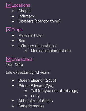
I read through existing retellings of the story, and noted down locations and key events in bullet points. I made notes of specific scenes I could include in comic panels, and arranged the events in the order they would be shown 1.2.1.
From this I made a list of locations, props, and characters which I wanted to include in the story 1.2.2.

Once I had the story notes, I made a rough storyboard to work out the pacing and page layout, placing specific scenes where I thought they would look good.
Whilst the storyboard is far from attractive 1.2.3, it helped greatly in camera placement and setting up scenes, and I stuck to the layout for the most part.
Before I began, I decided to research into stylised media for inspiration. I quickly found that comics from the “golden age” look outdated compared to modern webcomic styles that attract readers in the digital age. This led me to look towards webcomics for lettering and page layout, and anime and manga for character design.
I was struggling with choosing an art style for my characters, and was looking online for inspiration. Something I found which was very helpful is an art challenge in which people draw one character in many different styles. I collected some of these 1.3.1.1, and they gave me a good way of comparing specific facial features across different art styles.

I went through these and removed the ones I did not like until I was left with a selection of different art styles from which I could analyse and pick from 1.3.1.2.

I also collected a board of historical and interpretive clothing references 1.3.1.3 which I used to design the characters’ outfits.

Once I had my mood board of ideas, I set about designing a character.
I sketched the characters of Eleanor and Edward from orthographic views so I could use them as references when modelling. This incorporated features from the styles I liked best; block colours, smaller, more realistically shaped eyes than previous characters I had made with rounder corners for children, to name a few.

I sent this sketch to the client, and it was received positively. I was given some feedback on adjustments, which I notated on the sketch to revise 1.3.1.4. I sketched the other two characters, the monk and the abbot, in the same style 1.3.1.5.

Following from this, since a lot of the characters’ styles are based on other media, I found images of scenes from the original content, and I analysed and notated different techniques used, and what I liked about certain ones 1.3.2.1.

Below are some close-ups of the notation that I made across the illustrations. 1.3.2.2 is focussed more on the art style and the techniques used in layers and composition, whereas 1.3.2.3 is focussed more on shading and colour choices.


A common feature is a reduction in detail as the distance from the camera increases. This helps draw attention to focal points as well as keep the page from looking cluttered. This can be seen in the roof detail close to the camera, which is not included further back 1.3.2.4.
Contrast and saturation also changes, with more muted colours in the background and less sharp line art.

Looking through other webcomics’ page layout and lettering, I found inspiration in Mary Cagle’s Sleepless Domain. Different colour text and speech bubbles helps to identify characters, especially useful in action scenes or when they are not in the picture 1.3.3.1.
Different shaped speech bubbles or effects like the music notes 1.3.3.2 help to portray a tone of voice. This helps give more emotion to the speech, which I wanted to include.

I set up this timesheet 1.4.1 to keep track of the progress of the process from asset creation to page export, and to make sure I was completing tasks in the right order and in time. Due to personal issues I started running slightly behind schedule, but I managed to catch up time later.
As with previous work, the most difficult part is not managing the time to work on the project itself, but balancing time for multiple concurrent projects. This makes it hard to see if I am running to time; if another project is running ahead, it can feel like I am behind schedule despite still being on track to finish on time.
Since I was running a social media campaign at the same time as this project, I used it as a testing ground for new ideas. I created a set of characters for a chibi character project and experimented with topology, rigging, animation, and materials, the best parts of which I then took into this project.
Once the client and I were both happy with the sketched designs, I modelled a character base which I would model each character from 2.1.1.

I set up the facial shape keys for the base mesh, which would make it quicker to adjust for each character rather than starting from scratch. This used the same expression controller that I created for the chibi character rig 2.1.2.
I used a data transfer modifier with a proxy mesh to generate custom normals for the characters’ faces, and for Eleanor’s hair UVs.
Each character was only given a single outfit and hair style. This is to help identify the characters, which is something I found difficult in the original Beaulieu Abbey comic. I found it hard to tell whether it was the same character throughout after her appearance changed 2.1.1.

For long flowy skirts and drapes, I decided to use cloth physics, which I found had been surprisingly easy to use during the chibi project. I used a simplified proxy mesh with the physics simulation, which then transferred the deformation to the main model through a surface deform modifier 2.1.2.
Whilst I would not be animating the characters for this project, this still created realistic looking deformations in the material. Any small clipping problems could be fixed manually for the renders.
As with the chibi characters, I gave each character a different face and eye shape to help distinguish them.
The completed character models are shown below.


I directly modelled from the views in the rough storyboard I had drawn to build the scenes in 3D. This had multiple reasons; it allowed me to leave out objects that would block parts of the scene, ignore walls to allow unusual camera angles and let more light into the scene, and save time by not modelling things which would not be seen.
If I were planning on giving the storyboard over to somebody else to develop, I would have put more time into them to make them understandable. However, since I was only using it to put down initial ideas, it would be a waste of time to make them more detailed than necessary for me to understand what was happening in the scene.

I also made multiple versions of each scene for different camera angles. 3.1.1 is an example of this with half of the chapel, allowing me to light the scene differently and place a camera where it would be obscured by the wall of the complete model.
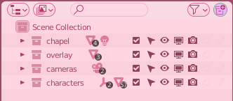
I modelled and rigged the characters in a separate .blend file, and each character had their own scene and collection within the file; this meant I had the characters kept in a single central location which I could append into each scene where they were needed. This helped keep the project organised.
Since the renders are static, I did not have to worry about perfectly fine tuning cloth simulation.
There were occasional problems where body parts clipped though clothing, and whilst I could spend time weight painting, adjusting proxy meshes, and changing simulation parameters, it would be no more beneficial than creating an adjustment shape key which I could apply for a certain pose.
This saved a lot of time and effort which was not needed for a comic. If I was doing animation, then it would be necessary to fix the problems at the cause rather than just adjusting the final result to fit.
Since I am modelling for a stylised aesthetic, I wanted to be able to have more control to light the scene unrealistically. Splitting the scene into different collections 3.4.1 allows me to use Blender’s render layers, rendering each individually with custom render passes, then later applying different post processing effects in compositing.
Here I was using three render layers, though I used a maximum of four; the scene background, the characters, any overlay for lighting effects, and foreground scene elements to be placed in front of the characters.
Render layers also make it possible to put lettering and effects between the characters and the background.
I set up the scene with completely separate lighting for the background and characters, allowing me to light the characters from different angles whilst not affecting the shadows cast on the background.
A slightly different angle for the sun light and small point lights as fills improve the look of shadows on the character for a specific camera angle 3.4.2.

By having completely separate light setups for characters and the environment, it meant that I had a lot more control over what each part would look like independently of one another, and could modify them in the editor before compositing.
Another example is in 3.4.3 where I wanted to light the character brighter, but still with form shadows for depth and interest which I would not get by simply increasing the brightness of the character layer.

For the line art, I used freestyle as a separate render layer so that I could composite them separately. As with the render layers, I kept the character line art separate from the background line art.
In my compositor stack 3.5.1, the top left group controls the background, where the bottom group is for the characters.

There is visibly less processing to the characters; this is because they are the focal point and I wanted to keep them looking clean and clear. After the layers are combined, I applied some final colour correction and some bloom from the background which helps to consolidate the image.
Another method I used to create a separation between foreground and background was rendering a depth pass, and modifying the blur, saturation, and contrast, amongst others, to increase the difference between the character and background layers, and by the distance to the camera.

A very early iteration can be seen in 3.5.2, and it does not look good.

The models are all complete in 3.5.3 but I had not yet applied any post processing. This gives it a bright, blocky look, which could work for some things but was not the style I was going for.

With the help of some colour correction and some sun beams created with an emission volume material rendering in real time, the scene looks a lot more coherent 3.5.4.

I wanted the characters to be the focal point, so decided to increase the contrast between the background and the characters 3.5.5. I did this with having them be brighter and with higher saturation, and I used a depth pass to add a distance fog to bring the focus away from the back of the chapel.

Finally, I took some of the environment light and boosted it, adding a bloom on top of the image to brighten up the scene and make it look less gloomy 3.5.6. This is the final composite.

The chapel windows used the “overlay” layer for imitated sun beams which were modelled in as solid objects with a material. This not only had better performance and allowed me to view them in real time, but I had more control over the look and direction. From the view in 3.5.7, it can be seen that not every window has a sun beam to keep the effect from becoming overpowering.
One issue I had with rendering the characters and background separately is that the characters would always be drawn above scene elements, even if they should be occluded. I solved this in two different ways.

In this scene 3.6.1, the monks are drawn above the bier (stretcher).

In this case, since the bier is a key prop in the scene, I moved it to one of the foreground collections to be drawn with the characters 3.6.2.

This solution was not always appropriate, however. In this scene 3.6.3, the occluding bed and biers should not be drawn with the same quality as the characters, instead taking the background post processing.

Applying a holdout collection to the foreground elements prevented the characters being rendered in front of them, but their outlines still remained 3.6.4. This is due to a freestyle limitation when calculating visibility.

I solved this by subtracting the alpha of the foreground elements from the outline layer in the compositor 3.6.5. This solved the problem for this camera angle.

My materials for this project are based on the toon shader that I have been developing for my own use over the past few years. A part of the NPR aesthetic that I wanted to capture is the reduction in detail where it is not needed without compromising on the overall detail in the scene. I modified my materials to account for this.
For my stylised brick material, I made it so that the number of shown bricks would reduce, before fading into a constant colour 3.7.1. This is through a procedural method getting the geometry’s distance to the camera. This kept the background from becoming distracting whilst giving enough information to the viewer to interpolate the rest of the wall.
For other materials such as the tiled floor, I had their texture fade out smoothly from the camera.

In the infirmary, the checker pattern fades away before the grid lines 3.7.2 because they created too densely packed detail where the tiles get visibly thinner due to perspective.
I chose to use Blender for the composition of image and text. Whilst a 2D design program would likely be better suited, I wanted to be able to make use of 3D assets and effects 4.1.1. Each page was rendered with an orthographic camera from above.

This is when I changed the overall composition. I had intended to use a grid based composition, but whilst I was moving images around I found that I liked the scattered scrapbook aesthetic. I chose to go with this since it is unique and attractive, and added a lined paper background and a white border to each frame to sell the look 4.1.2.


As discussed above, I chose to use a different colour for each character’s text and speech bubbles 4.2.1, to more clearly show who was speaking. Certain effects also used the characters’ colours.
I used two typefaces; a monospaced comic for sound and visual effects, and a curly script for speech and headings. This helped to look different to other comics and fit the medieval vibe, whilst not so cursive as to be difficult to read 4.2.2.

I fit in some effects on a speech bubble for the last page, to show a sense of content to the line 4.2.3. This helps to give the speech some extra emotion.

One scene where I prioritised entertainment above historical accuracy is in the infirmary in 4.3.1.

The syringe was not invented until around 600 years after the comic is set.
However, I wanted to visually imply medical tests were ongoing, and a doctors syringe gives the viewer an instant idea of what is happening. It also makes for a comedic frame.
The final result was an eight page comic which can be read below.
Through this project, I improved in planning, composition, and storytelling. Technical skills such as managing assets between scenes and files, and using the Blender compositor have also improved as a result of this project.
Storyboarding proved to increase efficiency by making sure I only made scenes that would be included in the final product. A comparison of one of the pages is included below 5.1, and you can see that most of the page is laid out as planned.

As I iterated through versions, I made changes to layout and composition, and made notes on renders which I wanted to adjust. Some of the exported pages and their iterations can be seen in 5.2.

Something I want to improve on further is working between different files. It would be useful to be able to streamline the process of modelling assets in different files and being able to consolidate them into a scene when required.