

Maintaining accounts on and posting on Instagram and LinkedIn to build a network of connections.
For the writeup about my social media content, click here to read the Chibi Characters article.
The goal for this project was to promote ourselves and our work online, since it is important to get your name known to find good jobs in the digital design industry.
I chose to use LinkedIn and Instagram, and set out specific goals for each platform, which are written in detail below.
I successfully managed to achieve my goal of increasing both my understanding of the platforms and appreciation of the importance of social media, as well as growing my connections and following.
For the writeup about my social media content, click here to read the Chibi Characters article.
I have completed many different projects since I started doing design work, and this presented a rather open question: who am I as a designer?
Whilst the diversity of work I have completed allowed me to learn many different skills and gain appreciation for different disciplines, it also meant that I don’t have a clear focus or a specialty.
I decided that my preferred discipline is in animated stylised film, and chose to present myself as a 3D character modeller with knowledge of lighting and stylised shaders. This would help inform what to post and who to connect with.
This ruled out an option to generate quick content from old projects; that would create an unorganised and inconsistent feed. That could be disadvantageous in the long run since people viewing my profile could not tell my specialty.
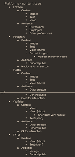
I began by analysing the types of content that best fit each social media platform and their users 1.2.1. At the same time, I did a similar exercise in reverse 1.2.2. Between these lists, I connected content with the appropriate platforms.
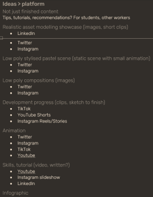
Whilst I would not have enough time to create full animated videos, I still wanted some animated content to attract attention and show off relevant skills.
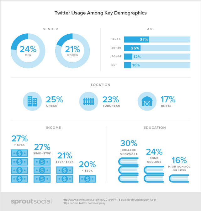
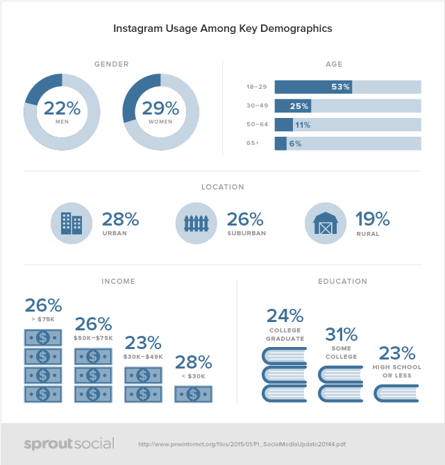
These are fairly different platforms, with Instagram being fully visual where Twitter seems to focus more on short-form text, though many designers still choose to use Twitter to showcase their work. I broke down each platform before deciding.
They have a similar user demographic, so the distribution of viewers would be similar. The number of people using Instagram is greater in total, but the increased audience is matched with increased competition so it is impossible to say if one is better than the other.
They both use hashtags which allow users to search by topics. For new accounts without a following, this is the most significant method by which a post’s reach can be increased.
Instagram has its hashtags hidden in the caption rather than as part of the post. This might be why it is more acceptable to use more hashtags, up to 30, on Instagram. On Twitter, posts begin to look very cluttered at a much lower number of hashtags, and it is discouraged to use any more than seven.
This gives an advantage to discovery on Instagram.
Instagram can only host one link, in your profile. Links can be shared in stories, but they are only available for a limited time and will likely only be seen by people already viewing your profile. Links cannot be shared in posts.
Twitter, however, excels at sharing external links. It embeds a preview at the bottom of a tweet with a link, and it is common practice and accepted to link external websites.
I wrote out some rough aims for the campaign, to help inform my final choice:
LinkedIn’s main focus is in industry connections, and that makes it a strong choice for networking. For a second platform, I wanted to focus on sharing visual content. Since discoverability was my main requirement, I chose Instagram for its reach through hashtags. This proved to be a good decision, as hashtags became my main method of getting discovered.
Whilst my main aims were to get more confident in showcasing my work and learning how to make use of each social media platform, these are not measurable goals, instead being skills which can and will continue to develop.
Therefore, to analyse my outcomes, I setup metrics in the form of SMART targets.
Since the feed is (by default) organised by each platforms’ promotional algorithm, I did not want to set an analytic based goal (such as post reach or follower number) since that would be more dependent on luck to achieve within the short time frame. It would also favour “click-bait” tactics over quality content which would grow numbers quicker in the short term, whilst damaging long term growth.
I set up Google analytics on my portfolio to record information about the viewers throughout the campaign.
Here I wanted to attract character illustrators, as well as a general audience. This would influence my writing style and post content.
Instagram is mobile focussed and most users access the platform with the mobile app. The feed appears the same on all devices so content should be optimised for a portrait feed.
Here I wanted to target employers and those working in animated film.
Whilst 57% of users are on mobile (LinkedIn 2018), since the desktop site loads in a narrow vertical container resembling the mobile app, content should always be optimised for a portrait feed.
However, the feed is not the main focus of the platform for a lot of users. A strong use of LinkedIn is the ability to connect with other people in industry or join relevant groups.
As a completely visual platform, every post must include an image or video. In the viewers’ feed, landscape images are shown at full width, losing out on screen space to squares or portrait images up to a maximum aspect ratio of 5:4. Reels are the exception to this as 2:1 videos which play automatically in the feed and on the Explore page, taking up twice the height of any other post.
Art theft is a problem on Instagram with work being stolen and reposted, or sold in merchandise, prints, or as NFTs, which the artist has no power to do anything about. This has led to the use of watermarking to protect the artists’ work.
Since I was starting off with no followers, the only way to get discovered without paid promotions is through hashtags. These allow users to find posts by searching through content rather than creators, allowing small artists to get noticed outside their network.
Instagram allows 30 hashtags, and whilst some sources recommend not using the full amount, there are no real reasons given. A previous workaround of putting tags in the comments of your post to hide them is said to now be disadvantageous for your post, especially if it is a popular tag where your post will quickly be lost amongst others.
Big accounts can get away with fewer hashtags since they will get promoted by the algorithm once their followers start interacting.
Whilst any information about how the algorithm works is entirely based on speculation, regular posting has been identified as beneficial for increased reach.
At the time of writing (08/02/2022), Meta’s stocks have fallen due to competition from growing social media platforms such as TikTok, and they have changed in an attempt to compete; they are now advocating for the creation of short videos based around current viral trends. This promoting of quick video content inadvertently punishes other creators, and many have found that they have had a significant decrease in reach, even to their own followers.
This has led to growing artists having to incorporate reels to post between full pieces, such as WIPs, breakdowns or speed-paints, since only releasing finished content is no longer sustainable.
Similarly to other social media platforms, visual content typically performs well, and short videos play on loop. Landscape media is shown at full width, with portrait content being compressed into a square.
A large amount of content is reshared from curator pages, and original written content is often business oriented. The only way for content reach to grow is for it to have been interacted with by one of your connections, or if people search or follow one of the included hashtags. However, it is recommended to use fewer hashtags with different sources saying to use between three and seven.
Posts are unlikely to be seen outside of your network of connections, unless it gains a lot of interaction from them quickly.
Whilst it is possible and popular to link to external sites, embedded videos are far more likely to be viewed, and if short enough, play automatically in the feed.
Successful social media campaigns have used UGCs (user-generated content) to increase their reach to participating viewers’ networks and to gain interactions. This makes it a powerful strategy since they do not have to spend time or money on the content that is produced, and it raises brand awareness without directly selling a product or service.
Since I was starting with no following, it would be impossible to encourage UGCs as part of my campaign since I had no viewers who could potentially participate.
My post schedule dictated the type of content I could create. I needed something with relatively quick turnaround that I could complete whilst balancing my other projects.
Since the posts would need to be coherent for the greatest success, I needed a theme throughout. Whilst there were many new skills I wanted to try, I did not know if my ability to pick them up would be good enough to create quality content quickly. Inspired by artist Vitaly Bulgarov’s, “one foot in order, one foot in chaos”, I made sure I was confident in my ability whilst taking some risk to improve.
I chose to dive into stylised, or NPR (Non-Photorealistic Rendering) characters. I could not have a single post for each character since that would leave too long in between posts so I had to think of ways for a single model to populate multiple posts, whilst making sure that my feed did not become repetitive.
I searched through relevant hashtags, and the captions of these posts gave me more tags to search through.
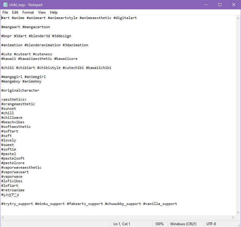
I kept a note of common tags and grouped them into categories 2.3.1.1.1 which I could pick from for my own captions.
Successful pages often have an attractive and consistent feed of work, saving WIPs and other content for stories and reels which can be separate from the main feed 2.3.1.1.2.

Aesthetically pleasing posts can be appreciated by less technical audiences and whilst WIPs and posts detailing techniques are not generally well received, video content such as timelapses or layer breakdowns perform well since people without understanding of the program can still appreciate a piece coming together.

Illustrators also reuse characters, building personalities around their OCs (original characters) 2.3.1.1.3. Building a story around the work helps their viewers feel like they get to know the characters and come back to see what they are getting up to, and is a possible way to get multiple posts per model.
The first line of the caption is important to grab the viewers’ attention. Many pages put a headline or a CTA (call to action), asking the viewer to interact, or a question to answer in the comments. People tended to be consistent in their own writing style, though the specific style, format, and formality varied greatly between accounts.
CTAs can be included as the last slide in a carousel. People use this to encourage interaction, or to visit their profile link for merchandise or other products. An example from artist trytryagain_ can be seen in 2.3.1.1.4.

Since zooming is limited, carousels are used to feature zoomed-in details so the viewer can easily get a closer look. An example by artist candycandie456 can be seen in 2.3.1.1.5.
Whilst stories are good to share content to your followers, their reach is very limited since it almost always stays within those who are already looking at or following your profile.
Throughout this, I made notes of specific content ideas 2.3.1.1.6.
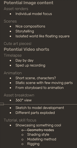

With the focus on the characters, I wanted to have a simple coloured background for each post. I was inspired by airii.exe 2.3.1.3 where the background is smaller than the post, giving the illusion of depth.

I started with the goal of releasing content in multiples of three to line up nicely in the feed. I decided on six types of content which I could reuse for each character.
This made use of images, carousels, videos, and reels, which are all of the primary content types on Instagram. I would save WIPs and updates for stories.
I wanted to create long-form posts since they are said to perform well on the platform; I made notes of specific topics that I could write about 2.3.2.1.
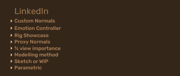
I would feature my characters from Instagram but with more formal written captions. I decided to use video for every post to make use of the attention grabbing motion.
There are many programs that help to create animated and interactive content, but I intended to create all of my animations in 3D.
I wanted to schedule posts to be released at a set date and time automatically, which is built into other social media platforms such as Twitter and YouTube. However, this feature is limited to the paid, full version of supporting apps.
I chose to prepare my post captions in Word, copy them into drafts on Instagram, then manually share at the correct date and time. I used Excel to manage my timetable.
This section details Instagram, but the process is the same for every platform.
I looked through multiple sources trying to find when they suggest the best time to post is, and made notes trying to work out when I would choose 2.5.1.1.

However, there are so many factors and every source disagrees.
With illustrators and animators in my preferred style located in North America and East Asia with a potential 12 hour time difference, post time was difficult to manage.
Since, by default, the feed is ordered by recommended rather than chronologically, posting times are only important for initial engagement.
Looking at my followed accounts, they seem to post at almost any time, though some were at least consistent with their days.
I chose to be consistent with my posting schedule, in the hope that my posts would be favoured by the algorithm by doing so, then once I had information about my audience, I could make an informed choice and adjust to fit.

Once I decided on the number of posts per week, I started drafting post schedules. 2.5.2.1 is a very early example.
Whilst time was ambiguous, the best days were fairly consistent. For Instagram, they were listed as Wednesday and Friday, with Monday close behind. Weekends were almost always listed as the worst.
I chose to post at the same time on each of these three days. To take advantage of the interaction that Wednesdays supposedly bring, I scheduled posts which I expected to be more popular. This turned out not to make a difference with my small audience.
LinkedIn however was consistently shown as favouring Tuesday and Thursday, with posts earlier in the day performing better.

I added my posting times to my timesheet 2.5.2.2, and alarms to my calendar to make sure I was posting at the correct times. This is how my timesheet looked near the start of the campaign.
Stories are highlighted at the top of followers feeds. This is a good way to get your post seen by people who follow many accounts or are having other posts promoted above yours in their feed.
I chose not to follow a strict schedule for these, posting in between other posts with lower effort updates and WIPs.

By using carousels with either image or video, interested viewers would be curious about later slides, which could hold them from scrolling past. Similarly, stickers in stories would encourage people to stop and interact.
I chose to format all of my captions the same, to be recognisable as my style 2.6.1, and I included questions to encourage interaction in the comments, though nobody ever directly answered. I replied to every comment.
For my longer posts, I needed to hook the reader to make them want to “see more”. I chose to use a question as the first line, asking something which my connections might want answered and implying that they could find out by reading on. This is a common strategy.
I ended the posts with questions to encourage comments and made an effort to respond to all of them.
Profiles give users the first impression about who you are. I researched into other successful accounts on each platform, and reused things that they did well.
Whilst I included a call to action to visit my portfolio from my profiles, this was difficult to justify as a key focus. I wanted to present myself as a stylised character artist, and would be posting work focussed around that, but if someone viewed my portfolio with the expectation of character modelling, rigging, and animation, they would find little value since my previous projects don’t include much of this.
Once I have written up this semester’s projects, I will have more character work on my portfolio and will be able to present it as a better representation of the work that I want to produce.
The first thing I did was switch to a creator account so I could access the analytics, and also add a title; I set this to “artist” as that seemed the most relevant out of the options given, though “digital creator” was another potential option.
For my profile image, I used a stylised character that I had made in a style that I like and would be creating content in, since that would give viewers an impression of what to expect and would attract people who are interested in that style.
Whilst most use the display name as a stylised version of their name or account name, I used it to also include my discipline, “3D Design”, since it is in bold at the top of my profile page,
I wrote a short bio with emoticons to make it colourful and eye-catching, and included a call to action to take the user to my portfolio website. Finally, I included some relevant hashtags to help get my account recommended 3.1.1.1.

Whilst most people use a photo of themselves as their LinkedIn profile picture, I wanted to use the same image across accounts and this would not fit with my Instagram brand.
Looking around, I did find that some successful character designers used avatars or characters that they have designed as their profile photo 3.1.2.1, which helps to give an idea of the style of work that they create.

I switched on creator mode, which allowed people to follow my account and give slightly more focus towards posting original content.
Whilst you can have an about section on your profile, the main focus is on your tagline. Most users use this to show their job title, but since it is the first thing people see whether they are viewing your full profile or in a search, I wanted to include keywords that industry connections might be interested in seeing 3.1.2.2.

Whilst I would have liked to include more character work in my banner image, I did not have enough to feature so chose to use a render from another project which has a nice composition.
Something I have considered is putting words on my banner image; since it is featured large at the top of my profile, it has the potential to include a short message which could showcase my work ethos and help viewers to connect.
In my featured 3.1.2.3, I included a link to my portfolio, which I mentioned in a call to action in the about section. I also included my successful posts and some renders from completed projects to show an eye for detail, composition, and quality.

I had planned to post consistently at the same time throughout the campaign, adjusting once I had enough data to make an informed decision.
However, Instagram analytics only gives information about followers once you hit 100, and I did not manage this during the campaign. As a result, I did not manage to get any information about my followers, and so continued to post at a consistent time.

With my content plan set to produce a coherent looking feed, I am quite happy with how it looks at the end of the campaign 4.2.1.
As I discuss later in this section, I changed the number of posts per group, and also the thumbnails. Some of the thumbnails for the same character look a bit too similar, so I will try to incorporate a different first slide in a carousel, or a custom reel thumbnail (more on that later).
I am happy that this gives the right first impression about the work I want to create.
I wanted to become active in the comments, in the hope of getting my name recognised, and my profile viewed. I commented on posts from illustrators that I admired, and these often resulted in getting replies, and sometimes they even viewed my profile and liked my work 4.3.1!

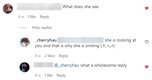
A comment I made even directly converted into a follower. I made a response to a comment on one of my early posts, and somebody saw it, replied, and followed shortly after 4.3.2. This suggests that showing my personality helped draw somebody to want to keep up with my work.
I was four posts into the campaign, and so far my reach so far had been better than expected. Hashtags were the main source of new viewers, and I was getting good engagement and gaining new viewers from them.
Since video content was said to be the best content for catching attention, engagement, and reach, I was excited to see how the upcoming videos would perform.
Unfortunately, I was to be disappointed. My IGTV video 4.4.1 performed the worst out of any of my posts, and remains with the lowest reach and engagement from the whole campaign.
This really pushed the idea that growth and success are not related to the amount of time put into the content, since this post took me the longest to complete.
IGTV Post Stats (At end of campaign)
I mentioned earlier that Instagram was favouring reels to compete with TikTok. What I had not realised was the extent to which this was true.
Slightly disappointed by the performance of my IGTV video, I posted my reel and left it for a day to see what happened.

Looking at my reach the day afterwards, it had outperformed my other posts by a long shot, ruining any chance of taking a reasonable looking screenshot of the graph 4.5.1.
Of course, a large number of views does not mean a relevant audience, but in a random group of 3,300, there are almost certainly to be more than in the comparable tiny sample sizes that is the reach of my previous posts, especially since the algorithm would be promoting my reel not to a random group, but to those who have shown interest in content with similar tags.
Reels have less insights than posts do, so I cannot say for certain where they came from. For a new account without any following, gaining a large reach quickly was a big advantage.
Towards the end of the campaign, I did notice that I was gaining one or two new followers for each reel that I posted, which further suggests that they were being shown to relevant users.
I was creating custom thumbnails for my videos, but not for reels. However, I added a thumbnail to one of the reels near the middle of my campaign 4.5.2.1, and it became my most popular post.

Whilst not a massive overperformance, it is still notably more successful than any other post 4.5.2.2.

I will experiment more with using custom thumbnails to see if they can help increase the reach of my posts.
An example of UGCs in the illustration community are “Draw this in your style” (DTIYS) competitions. Hosting these encourages other illustrators to create their own interpretation of your artwork, and you benefit from increased awareness whilst they benefit from getting shared and possible competition prizes.
Whilst I did not have the audience to host one, I could join in a more popular artists’ DTIYS, possibly increasing my reach by getting shared, and even more so if I happen to win a prize or get shared as an honourable mention. Some people also look through competition entries, so that would be another way of getting discovered.
I looked through my followed illustrators for an ongoing competition, and there were many. I chose one with a character that I thought I could create a good representation of in my style, and was hosted by someone with a decently sized following 4.6.1.

Working with a character designed by somebody else was a lot of fun, incorporating elements that I would not have designed into my own characters.

Two of my posts got liked and commented on by the host, and were shared in their story 4.6.2. The first post quickly climbed to the highest reach of any of my image carousel posts 4.6.3.

Continuing, I want to try to find other ways which I can leverage content that will be reshared by more popular relevant parties to expand my reach to audiences that already exist and would appreciate my content if they were to find it.
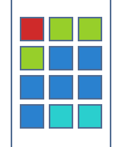
Whilst I started with groups of three (which ended up being groups of six because I could not create a new character every week) I found a problem.
Most importantly, six posts with a single character was quite a lot, and the interaction decreased towards the later posts as people probably got bored or thought they had already seen it.
Secondly, it did not group the feed as nicely as I had imagined. Groups of three have sections disconnect, and groups of six spend two out of three posts out of line with one another 4.7.1. Also, since I was not posting the same post in the same order for each character, other than the teaser silhouette post followed by the reveal, the other four were only linked together by their background colour.
Instead, I found that groups of four posts worked better overall. There will always be a group of posts that align into a block in the three wide feed, and all the posts with the same background will still be touching.

The example in 4.7.2 shows how this would look in a feed as the new red squares are added. Each colour always has an even sized section which is all connected, and there is always a section with a flat bottom.
Groups of four posts also resulted in better engagement, since people were less likely to find the posts repetitive.
One of the first things I noticed on LinkedIn was that the content feed provided no value. I was finding it difficult to see how creating content on LinkedIn could be beneficial. Even searching through hashtags left me looking at fairly poor posts with little interaction.
So, instead of focussing on content, I began by trying to connect. Since you cannot connect with people outside of your network, this began as a very limited group. However, the size of this pool quickly expanded once I started getting some relevant industry connections in studios working in animation and character art.
Once I had grown my network to over 100 relevant industry connections, I found that I could see a lot more potential people to add to my network, and there were not as many hidden profiles which I was not allowed to see.
This had an unexpected effect on my feed; with so many relevant connections, I began seeing content that they post or interact with, and this mean that the posts I was seeing were more relevant to my industry and had more interaction. I realised that my immediate audience would be made up of my network: my connections and their connections, to a depth of what LinkedIn refers to as a “3rd”.
I posted once a week, alternating between character showcases and long educational posts. Neither seemed to be more successful than the other, and interaction varied. Since every interaction is shared to the users’ network, every time anybody engages, a post gains a large increase in reach.
I had this happen with my very first post 5.2.1. It was a long post about character shading, which would be popular with my connections who were primarily character artists or working in stylised film.
I started with a question that they might have had, or be curious about since it is relevant to the industry; I think this helped to get people interested early, along with the autoplaying video.
The body text introduced an interesting topic but I kept it easy to read so that anybody would be able to learn, linking to UN development goal 17 in access to innovation and knowledge sharing. The graphic was interesting enough that it could also engage people outside of the industry.
This post started strong and went on to get (at the time of writing) over 2000 impressions, 750 views by 650 different people, and over 60 interactions.

A significant proportion of these viewers were from North America 5.2.2. This makes sense since whilst I do have some connections there, there are a significant number of animation studios and relevant parties located there.

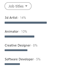
Once somebody from a big studio in North America interacts with the post, many other people from their workplace, other studios, or just people they know locally will begin to see the post in their feed; this can be seen in the companies 5.2.3 and job titles 5.2.4 of the people that viewed the post.
Other than a significant number of people from big name companies seeing the post which is an achievement in itself, the top company only having 2% of the total views suggests that people from a very large number of different companies have seen it.
Unfortunately, I was not able to replicate this success. Almost all of my other posts, whether about a character or a technical writeup like my first, have similar impressions and interaction.
My first character post 5.2.5 managed the next highest interactions and over 700 impressions.
Whilst I cannot say for certain why my other long form posts did not perform as well, I think it may be due to the visual graphic being less immediately interesting, and the topics being a bit more technical; they might be difficult for someone who does not work with stylised 3D characters to understand.
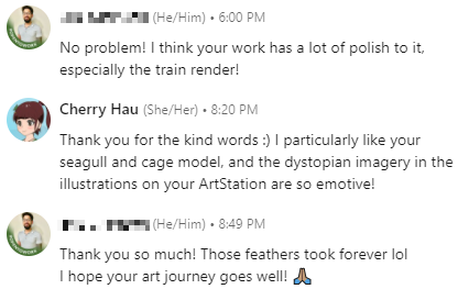
Whilst connecting with new people, I also spent some time messaging people in industry. I had multiple short conversations in direct messages with other 3D character artists, and we spoke about programs and workflows, and discussed each other’s portfolios 5.3.1, 5.3.2.

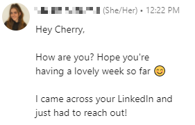
I also had someone reach out to me 5.3.3; a recruiter from Bristol in the 3D industry. We had a short phone call (on the actual telephone!) talking about my goals, and intend to stay in contact.
About half way though the campaign, I took a look at my website’s Google analytics 6.1.1.

That’s… interesting.
Of course, the home page got the most views – that was not a surprise. I had heard that the about page is usually popular, but I was still surprised to see it as the second most viewed page. Because of this, I overhauled my about page to be a lot more engaging and put across more personality through my choice of images, layout, and text.
I was very surprised to see my “Web: Projects” page next and for a period of time it was actually above my about page. Since the two “Web:” pages are not in the home page carousel or in my featured projects, it appears that people were looking for them. A possible explanation for this is because I have the HTML and CSS skills badge on LinkedIn, and people wanted to see my experience in web development.
To take away from this focus, I also overhauled my home page to put more focus on my 3D projects and kept any reference to the Web: Projects to the off canvas menu and footer. I also moved up my Unity skills badge above CSS and HTML on my LinkedIn profile, and set 3D Modelling as my top skill, despite it not having a skills badge.
I had a page named “3D: Gallery”, which was an archive of old work; I kept it to show my development from when I started to where I am now. However, I realised that people may be viewing it expecting to see an easily digestible image feed of all of my work. I renamed it to more clearly show that it is not where to find my current projects.
Whilst I was not getting any notable increase in website traffic on post days, I suspect that viewers would fall to zero if I had not been posting at all, since that is what it was before the campaign start.

After rearranging my home page to draw even less attention to my web-development articles, I received no more viewers to those.
Interestingly, my “3D: Projects” page gained momentum with 14 new viewers and overtook my about page which only received another 4. This did not translate to more article views, which suggests that the viewers just scrolled through my list of projects. Either my thumbnails and taglines are not engaging enough, the projects I had completed were not expected of a character artist, or the viewer just wanted to see what I had done without reading the details – it’s impossible to know for certain.
My RSA project continued to be the only article with noticeable viewership, likely since it is the first project on my home page carousel. It is also the only project on my website which I received direct feedback on from some of my connections.

The initial spike in views 6.2.2 is almost certainly from initially gaining connections on LinkedIn, and the falloff in the 30 day line is the opposite reaction from this. This shows that whilst connecting with people does generate website traffic, it is not a sustainable way of maintaining views.
Other than that, click-throughs to my website remained fairly consistent throughout the campaign with the 7 day moving average oscillating around 4 viewers daily. This did not seem to be impacted by post days.
The sources of my website viewers can be seen in 6.2.3. I was surprised to see such a small number from LinkedIn, so I investigated further.

I started the campaign with an unsecured “http” website, though after a few weeks it was updated to have a secured “https” counterpart.
This is significant because when a user navigates from a secured site such as LinkedIn to an unsecured site such as the one I started with, data about where the user came from is lost and Google Analytics marks the source as (direct), which includes every unknown source. It is therefore likely that a large proportion of the unaccounted 27 (direct) views are from LinkedIn.
I was surprised to see any viewers from Facebook, since I had never posted there, and it was interesting to see that some, albeit few people have found my website through search engines.

I managed to maintain three posts per week on Instagram for almost every week in the campaign, other than one where I was working on Nekomi for the DTIYS competition where I only managed two posts, so that’s a partial success. I managed this by breaking down the creation of each character into small tasks which I set independent deadlines for. This can be seen under ID:5 on my timesheet 7.1.1.
One post was posted on the wrong day; reels can only be posted on mobile, and I was in the university building when my alarm went off. Since I have no signal indoors and was having trouble with the Wi-Fi, I did not post straight away and forgot when I left the building for the day. This is one of the benefits of using supporting software that allow you to schedule posts, since you can prepare it long in advance and not have to worry when it goes live.
LinkedIn I kept with a post every week as intended, so that’s a success. I did not create as many long form posts as I wanted to, since I was getting very busy towards the end but still managed to create character posts to release on time.
I planned to prepare posts ahead of time so that I would not have to worry about creating new content on the day, but the schedule started to catch up with me towards the end.
Whilst I managed to get replies and profile views from comments on other artists work, I did not receive any comments or follows of my own.
I managed to gain connections with other character artists on LinkedIn, but not someone working specifically in the style or line of work I want to work in. I found that most of the studios working in cel-shaded 3D are located in Japan, whereas a majority of my connections were understandably English speaking from Europe and North America.
On Instagram however, when I joined SpoonIllust’s DTIYS, I received a follow, multiple comments, and shares on two of my posts, so I consider that goal a success.
As discussed above, I did manage to maintain viewers to my website throughout the campaign. From the location demographics, I can see that there were relatively many unique viewers from around the country, and a few around the world.
Whilst the traffic appears to have fallen off, that is to be expected since the initial spike almost certainly came from gaining about 100 connections on LinkedIn within a couple of days, and discounting that, the traffic was relatively consistent.
Throughout this project, I achieved my goals of gaining an understand of using social media, increasing my confidence in promoting my work, and building my character portfolio. I gained some valuable connections, and intend to maintain building on what I have achieved throughout the campaign.